Step 6 is the logo. That’s why so many brands look generic: nothing came before it. These are the twelve steps I use to build a brand from zero, each one shown on three real projects, with every ChatGPT prompt and the layouts I build in Claude Design.
a.Achraf ArabiFrom Building Tchini, episode 2
Pick a brand. Every step below switches to it.
The inspiration engine
Two studio projects, taken apart.
Before writing this, I studied two case studies on Behance, a mascot family and a bakery identity. They look nothing alike, but they’re built the same way: a few parts, reused everywhere. Their methods run through steps 05, 06, 08, 09 and 10. Their images aren’t reproduced here. They belong to the studios, and they’re worth the visit.
BAR
Mascot Collection
One blank body+a costume+a face+two colours=a new member
Three characters, one soft white body with no face. A peanut shell, a cat-ear beanie or a bucket hat makes each one somebody. The faces come from one small kit of eyes and mouths, and every member gets exactly two colours. Then come the turnaround sheets, the stickers, the names spelled in fur, and a real beanie on a real head.
One glyph+one loud colour+two fonts+one line+three tiles=a whole bakery
A bakery in cobalt blue, a colour no bread is. The only twist in the logo is a little roof over the Ô. Every pastry is drawn once, in the same marker line, and that drawing becomes the label, the sticker, the wrapping paper and the website menu. The Instagram grid repeats three tile types and never looks busy.
Search “Arôme Bakery” on Behance
Who does what
Two tools, one decider.
ChatGPT
makes the pictures
Masters, turnarounds, outfits, poses, materials, scenes, icon sheets. Attach the master every time and ask for no text.
Claude Design
makes the layouts
Brand boards, post templates, labels, the case study. Type stays live, so you fix a word without regenerating an image.
You
make the decisions
What never changes, which result to keep, what to redraw by hand. AI makes options. You pick.
Before you design anything, look at what is already out there. Screenshot the category, write down every mistake, and find what everyone repeats.
OutputA one-page list of problems.
Tchinia real iOS appGym apps tend to share one picture: a dumbbell, a lightning bolt, a pulse line, on blue, green or purple. If the name and the look are generic, the product feels generic too.
Generic examples, made for this guide.
Gnasha chips brandWe pulled posts from the chips aisle and logged everything we saw twice.
01Typos on the pack
02The same AI face, twice
03A logo pasted on flat
04Red and yellow, again
What we logged, written as a list. The real brands stay unnamed.
SMILEa family food-ordering appSending a meal or groceries to family in Algeria from abroad means apps built around the person paying. Nobody puts the person receiving at the centre.
01One app per need
02The payer is the hero, not the family
03Cold, corporate colours
04Prices and order states hard to read
Your turn
Screenshot 20 brands in your category, on the shelf or the App Store, not on their best day.
Write every repeated colour, symbol and phrase on one page.
Circle the three mistakes you will never make.
AvoidStarting from a logo you like. Start from a problem you can name.
02Step 02 · Phase 1 · Strategy
Find one insight
Write down what each competitor owns. Then find the one thing nobody owns, backed by something true: a study, a habit, a moment.
OutputOne sentence you can build everything on.
Tchinia real iOS appThe moment that matters is the end of the rest. So orange became a signal: it only shows up when it means something, like a reward or the rest hitting zero.
Gnasha chips brandEach big chip brand owns one thing: farm-fresh, the tube, intense flavour, craft. Nobody owns the sound. A 2004 study found chips were rated crisper when the crunch sounded louder. The idea: Eat it loud.
Page from the Gnash brand book.
SMILEa family food-ordering appThe person who matters is the one receiving, the « proche ». So SMILE names them wherever a decision depends on them. The promise fits in one line: un repas chaud à la porte de ceux que vous aimez.
Made for this guide in ChatGPT, with the master attached.
Your turn
List what each competitor owns, in two or three words.
Find the empty square: a sense, a moment, a person nobody talks to.
Back it with one true fact. Write it as one sentence.
AvoidAn insight you cannot prove. A study supports an attitude, never a product claim.
03Step 03 · Phase 1 · Strategy
Write the platform
Answer the twelve definitions in one line each before any design: strategy, identity, positioning, perception, equity, relationship, communication, experience, architecture, growth, reputation, evolution.
OutputThe brand platform, on one page.
Tchinia real iOS appFour rules came first, and every image since has followed them: orange is a signal, tactile not flat, no words in images, one mascot, always.
Gnasha chips brandAll twelve, written before any packaging. Architecture: one master brand, three flavours, three formats. Reputation: when it is serious, the band stops playing.
Page from the Gnash brand book.
SMILEa family food-ordering appThree words, each with its opposite and what it changes on screen.
Warm, not coldHuman language, a sunshine accent, rounded controls, real family moments.
Clear, not confusingThe person receiving is named. Prices and order states are easy to read.
Dependable, not unpredictableThe same controls everywhere, visible progress, honest errors.
Your turn
Answer the twelve definitions below in one line each.
Pick three words, and write the opposite of each.
Turn every word into one rule you can see on screen.
AvoidValues like quality and passion. If every brand could sign it, cut it.
Worksheet: the twelve definitions
Answer each one in a single line. If you can’t, you’re not ready to design.
StrategyWhy does it exist, and how will it win?
IdentityWho is it, in four words? What is it never?
PositioningFor [who], it is the [category] that [difference], because [proof].
PerceptionWhat should people say after 3 seconds? After a year?
EquityWhat do you want to own, in order?
RelationshipWhat role does it play for people? What do you call them?
CommunicationYour three messages, in order. Where do you say them?
ExperienceWhat happens at every moment someone touches it?
ArchitectureHow are products and formats named and organised?
GrowthWhat is the next move, and when do you earn it?
ReputationWhat do you promise? What do you do when it goes wrong?
EvolutionWhat never changes, and what can?
Phase 2Identity
04Step 04 · Phase 2 · Identity
Name it
Make a long list, then cut it with four checks: short, easy to say, points at the idea, not already taken. Search every finalist.
OutputOne name, checked.
Tchinia real iOS appIt started under a placeholder, Gym Focus. Orange was already the brand, so I looked up orange in Amazigh: Tchini.
Recreation, not the real site.
Gnasha chips brandTo gnash is to grind your teeth. Short, hard, and it puts teeth at the centre of the brand. We searched for clashes and checked how a voice says the silent G.
Page from the Gnash brand book.
SMILEa family food-ordering appSMILE is the client’s working name, and the checks found two similar names already in use. So nothing is registered yet, and every asset is built to be renamed in an afternoon. A check that says “not yet” is still a result.
The SMILE logo: two dots and a smile arc next to the word smile
Your turn
Write fifty names. Keep ten.
Cut with the four checks: short, easy to say, points at the idea, not taken.
Search the finalists: trademarks, domains, app stores, and how a voice reads them.
AvoidA name you have to explain every time. If it needs a story, the story must fit in one sentence.
05Step 05 · Phase 2 · Identity
Build the mascot
A logo is seen once. A mascot shows up after every set and on every bag. BAR’s mascot collection shows how to build one as a kit, so a new character takes an afternoon, not a month.
OutputOne master image and its list of anchors.
Start from a blank and lock one master
Tchinia real iOS appThe style came from Pinterest: a chunky plush figure, like a designer toy. One master image, and every image after it starts from that master. The anchors: hood always up, orange face, two glowing eyes, no mouth, orange gloves, the emblem.
The Tchini master: a plush figure in a charcoal hoodie with a glowing orange face
Use the first attached image as the identity reference for the character only, and copy exactly: its small chunky designer-toy proportions, about three and a half heads tall; the perfectly smooth featureless matte signal-orange (#FF5B1F) velvet face framed by a hood that is always up; the two tall vertical oval eyes glowing a soft warm white; and the plush signal-orange gloved hands with a thumb and four soft fingers. Ignore the clothing in the attached image and dress the character only in the outfit described below. Wherever the outfit leaves arms or legs bare, the character's body is the same soft signal-orange velvet as its face.

Outfit: the starter look. A heavyweight charcoal-graphite (#2A2A2D) fleece hoodie with the hood up, kangaroo pocket and grey drawstrings ending in small signal-orange aglets; a small orange felt emblem of a circle, a square and a triangle on the left chest; oversized charcoal-graphite fleece joggers gathered at ribbed ankle cuffs; plain chalk-white leather low-top trainers with charcoal-graphite laces and no logo. The hood stays up and frames the face; no part of the outfit covers the face.

Pose and expression: standing tall in a confident hero stance, facing the camera at a slight three-quarter turn to the left, feet a little wider than the hips, chest proud, chin slightly raised, the glowing eyes calm and steady. Both fists rest on the hips.

Environment: an empty photo studio with a seamless light grey paper backdrop (#E6E6E8) curving into the floor, nothing else in the frame.

Composition: full body, centred, clear space above the hood and below the feet, a soft contact shadow on the floor directly below, the silhouette fully readable with no limb crossing the face.

Camera: product-style studio shot, camera at the height of the character's chest, 85mm lens equivalent, f/8 so the whole figure is in sharp focus.

Lighting: a large soft box above and to the front left as key, a weaker soft fill from the right, a gentle overhead light lifting the top of the hood, soft graduated shadows in the fabric folds, the eye glow casting a subtle warm light inside the hood.

Mood: eager, ready.

Material realism: true-to-life fabric weight and texture for every garment, natural folds at the elbows, waist and knees, soft fuzz on the orange velvet face, hands and any bare limbs, fine stitching on seams and the emblem.

Style: premium 3D collectible designer-toy character render, soft-touch physical materials, clean studio product photography.

Colour treatment: neutral and true-to-colour, clean light greys, the outfit's own colours as described, signal orange (#FF5B1F) on the face, hands and the accents named in the outfit, warm white eye glow, no colour cast.

Avoid: any text, letters, numbers or logos anywhere, including on clothing, shoes and props; a mouth, nose or human skin; extra fingers; a second character. The hood down or missing; the face covered or recoloured.
Gnasha chips brandTwo rounds died first. Round one explored shapes, round two still felt generic. Then: modernise it. The answer was a band, one member per flavour. Different bodies, the same huge square teeth, two inks each.
ChatGPT promptStart here: the SingerGPT Image 2, 1:1, nothing attached. Generate three. If the style is wrong here, it will be wrong on every member.
A flat modern two-ink illustration of an original cartoon character for a potato chip brand, one figure alone as a die-cut sticker in the centre of the page. The character is a chunky lumpy potato with a big simple rounded body filled in flat butter yellow, drawn with a thick even outline in electric cobalt blue, and two small cobalt dimples on its side like the eyes on a real potato. It is the lead singer of a rock band, leaning far back from the waist in a full scream. Its enormous open mouth takes up the top half of its body and shows two rows of huge square cream-white teeth, with a solid cobalt blue mouth interior. Its two eyes are squeezed shut into thick curved cobalt lines of pure joy. One thick tube-shaped cobalt arm grips a chunky simple microphone right in front of its mouth, and the other arm is flung straight up with an open hand. Two thick tube-shaped legs in butter yellow with cobalt outlines end in big chunky flat shoes, one foot stomping forward and the other heel lifted. Four large square salt crystals in butter yellow burst outward from the mouth like the sound of the scream. Around the whole figure runs a clean even border of butter yellow, like a die-cut sticker edge. The background is one flat even near-black colour, hex 14161A, edge to edge. Straight side-on three-quarter view, the full figure visible, centred, filling about two thirds of the frame. Flat ink with no lighting at all. Loud, joyful mood. Style of a contemporary independent snack brand illustration and a modern band poster: bold, simple, chunky shapes with confident hand-drawn wobble, exactly two inks, cobalt blue and butter yellow, plus cream-white teeth. Square 1:1 format. Clean flat colour fills only, with no gradients, no shading, no halftone dots, no grain, no 3D, no text, no letters, no logo.
SMILEa family food-ordering appThe master was made from words alone, then every other pose attached it. A sunshine-yellow head that is half its height, two charcoal dots and a curve that echo the logo, no clothes, no hair.
The SMILE master: a yellow designer-toy character waving
ChatGPT promptThe master promptThe one image made from text only. Transparent background.
Use case: stylized-concept. Create an ORIGINAL premium 3D mascot for SMILE, a warm family-focused mobile service brand. Single character full body, centered, front three-quarter view, welcoming wave, isolated on TRUE TRANSPARENT alpha background. A cuddly designer-toy character with a large softly rounded sunshine-yellow head (not a hat), tiny compact matching sunshine-yellow body, stubby rounded arms and feet, elegant charcoal oval dot eyes and a clean charcoal curved smile arc echoing SMILE's two-dot and curved-arc logo. Very subtle warm rosy cheeks, no nose, no mouth beak, no clothing, no glasses, no hair, no text. Proportions: head around 55% of total height, friendly compact silhouette, arms integrated into body. Luxurious matte soft vinyl/clay material, believable subsurface shading, exquisite soft studio lighting, gentle ambient occlusion, smooth sculpted volume, crisp professional high-detail render, refined bevels, no black outlines. A warm reassuring personality. Reference inspiration is the craftsmanship of a friendly lime-green 3D creature and a compact charcoal/yellow toy mascot, but this is a distinctly ORIGINAL smile-shaped yellow character, do not copy either character. Entire body with plenty of transparent margin, no crop, no pedestal, no floor plane, no background, no lettering, no watermark. Highest available visual quality and resolution. This is the master identity for subsequent consistent action poses.
Turn it around
Tchinia real iOS appThe back is the view people forget. Here the hood still reads as a hood, and nothing orange appears where it should not.
Made for this guide in ChatGPT, with the master attached.
ChatGPT promptTurnaround promptAttach the master. 3:2 landscape.
The attached image is the identity lock: the approved master of an existing mascot. Keep exactly this character and change nothing about it: a plush designer-toy figure in a charcoal fleece hoodie with the hood always up, a round signal-orange face with two soft white glowing oval eyes and no mouth, orange mitten-like gloves, a small orange emblem on the left chest made of a circle, a square and a triangle in a row, two charcoal drawstrings with orange tips, charcoal fleece joggers and chunky white sneakers. Same proportions, same materials, same face.

Create a character turnaround sheet of this one character: four full-body views standing side by side in a single row, evenly spaced, all at exactly the same scale and height. From left to right: front view, right side profile, back view showing the hood and the back of the hoodie from behind, and a three-quarter view from the left. The same neutral standing pose in every view, arms relaxed at the sides, feet flat on the floor.

Background: one seamless light warm-grey studio sweep, hex E8E7E4, edge to edge. Camera: straight-on product view at chest height with almost no perspective, every figure fully visible with generous space above the hood and below the sneakers. Light: a large soft key light from the front left, soft fill from the right, a gentle contact shadow under each pair of sneakers, no hard rim light. Materials: soft fleece with visible fibres, a matte felt-like orange face with a subtle inner glow, clean white leather sneakers.

Wide 3:2 landscape image. No text, no labels, no numbers, no arrows, no grid lines.
Gnasha chips brandGnash skips the turnaround. The band is flat vector, so the approved art was cut into layers and rigged in Blender: 24 fps, 12 frames a beat. The rig is the turnaround, and no AI ever redraws it.
Page from the Gnash brand book.
SMILEa family food-ordering appFrom the side, SMILE is mostly head: one eye and the start of the smile. That is the view to check whenever it walks or runs.
Made for this guide in ChatGPT, with the master attached.
ChatGPT promptTurnaround promptAttach the master. 3:2 landscape.
The attached image is the identity lock: the approved master of an existing mascot. Keep exactly this character and change nothing about it: a cuddly designer-toy figure with a large softly rounded sunshine-yellow head, charcoal oval dot eyes, a clean charcoal curved smile arc, very subtle rosy cheeks, no nose, no hair, no clothes, a compact sunshine-yellow body with stubby rounded arms and feet, all in matte soft vinyl. Same proportions: the head is about 55 percent of the total height.

Create a character turnaround sheet of this one character: four full-body views standing side by side in a single row, evenly spaced, all at exactly the same scale and height. From left to right: front view, right side profile, back view showing the smooth back of the head and body, and a three-quarter view from the left. The same calm standing pose in every view, arms relaxed at the sides.

Background: one seamless pale cream studio sweep, hex FFF6D2, edge to edge. Camera: straight-on product view at body height with almost no perspective, every figure fully visible with generous space around it. Light: a large soft key light from the front left, soft fill from the right, gentle ambient occlusion and a soft contact shadow under each figure. Material: matte soft vinyl with gentle subsurface glow, smooth sculpted volumes, refined bevels, no outlines.

Wide 3:2 landscape image. No text, no labels, no numbers, no arrows, no grid lines.
Dress them up
Tchinia real iOS appForty outfits, one body. Each one unlocks in the app. The prompt keeps the face, eyes, gloves and proportions from the master and replaces only the clothes.
ChatGPT promptOne outfit: the BoxerAttach mascot-master-v2 as identity only. 3:4. Same studio and light every time.
Use the first attached image as the identity reference for the character only, and copy exactly: its small chunky designer-toy proportions, about three and a half heads tall; the perfectly smooth featureless matte signal-orange (#FF5B1F) velvet face framed by a hood that is always up; the two tall vertical oval eyes glowing a soft warm white; and the plush signal-orange gloved hands with a thumb and four soft fingers. Ignore the clothing in the attached image and dress the character only in the outfit described below. Wherever the outfit leaves arms or legs bare, the character's body is the same soft signal-orange velvet as its face.

Outfit: boxing training. A charcoal-graphite hooded sweat top with the hood up and the sleeves pushed to the elbows showing the orange velvet forearms, the small orange felt emblem of a circle, a square and a triangle on the left chest; black satin boxing shorts with a wide signal-orange waistband; tall charcoal-graphite boxing boots with chalk-white soles and no logo; plump signal-orange felt boxing gloves worn over the hands. The hood stays up and frames the face; no part of the outfit covers the face.

Pose and expression: in a boxing guard, gloves up in front of the chest leaving the face fully visible, front foot forward, slight bounce in the knees, three-quarter turn to the left, the glowing eyes narrowed and focused.

Environment: an empty photo studio with a seamless light grey paper backdrop (#E6E6E8) curving into the floor, nothing else in the frame except the props named above.

Composition: full body, centred, clear space above the hood and below the feet, a soft contact shadow on the floor directly below, the silhouette fully readable with no limb or prop crossing the face.

Camera: product-style studio shot, camera at the height of the character's chest, 85mm lens equivalent, f/8 so the whole figure and every prop are in sharp focus.

Lighting: a large soft box above and to the front left as key, a weaker soft fill from the right, a gentle overhead light lifting the top of the hood, soft graduated shadows in the fabric folds, the eye glow casting a subtle warm light inside the hood.

Mood: fierce, ready.

Material realism: true-to-life fabric weight and texture for every garment, natural folds at the elbows, waist and knees, soft fuzz on the orange velvet face, hands and any bare limbs, fine stitching on seams and the emblem, props made of soft felt or the real material named, with plausible weight.

Style: premium 3D collectible designer-toy character render, soft-touch physical materials, clean studio product photography.

Colour treatment: neutral and true-to-colour, clean light greys, the outfit's own colours as described, signal orange (#FF5B1F) on the face, hands and the accents named in the outfit, warm white eye glow, no colour cast.

Avoid: any text, letters, numbers or logos anywhere, including on clothing, shoes and props; a mouth, nose or human skin; extra fingers; a second character. The hood down or missing; the face covered, masked or recoloured; any real brand's stripes, swooshes or marks.
Gnasha chips brandOne member per flavour. Classic Salted is a potato who sings, Fried Chicken is a drumstick on drums, Cheese & Onion is an onion with a cheese guitar. A new flavour is a new member, built the same way.
The SingerThe DrummerThe Guitarist
ChatGPT promptOne member: the DrummerGPT Image 2, 1:1. The chosen result was redrawn as clean vector.
A flat modern two-ink illustration of an original cartoon character for a potato chip brand, one figure alone as a die-cut sticker in the centre of the page. The character is a chunky fried chicken drumstick, with a big rounded body filled in flat cream and covered in a few large simple bumpy crust shapes along its outline, drawn with a thick even outline in hot red-orange. The clean bone sticks straight up out of the top of its head like a funny hairstyle. It is the drummer of a rock band, caught in mid-air above a single round snare drum, arms raised high at the top of a huge swing. Its wide grin runs across its whole body, showing two rows of huge square white teeth pressed together with the effort, and its two half-closed eyes are heavy with pleasure, drawn in thick red-orange lines. Two thick tube-shaped red-orange arms each hold one long plain drum stick above its head. Two thick tube-shaped cream legs with red-orange outlines kick out to either side, ending in big chunky flat shoes. The snare drum below is a simple flat red-orange cylinder with a cream top, and three short thick red-orange lines burst out from it to show the sound of the hit. Around the whole figure runs a clean even border of cream, like a die-cut sticker edge. The background is one flat even near-black colour, hex 14161A, edge to edge. Straight-on front view, the full figure and drum visible, centred, filling about two thirds of the frame. Flat ink with no lighting at all. Wild, delighted mood. Style of a contemporary independent snack brand illustration and a modern band poster: bold, simple, chunky shapes with confident hand-drawn wobble, exactly two inks, hot red-orange and cream, plus white teeth. Square 1:1 format. Clean flat colour fills only, with no gradients, no shading, no halftone dots, no grain, no 3D, no text, no letters, no logo.
SMILEa family food-ordering appSMILE never wears a costume. It holds one. Each job gets a prop: couscous for meals, bags for groceries, a scooter for the delivery, a headset for help.
Holding couscousCarrying groceriesOn a delivery scooterWearing a headset
ChatGPT promptOne prop: mealsAttach the master. Transparent background.
Use case: identity-preserve. Use the reference as the exact original SMILE mascot identity. Render ONE full-body 3D pose: Holding a steaming bowl of couscous with visible vegetables in both hands. Keep the same large rounded yellow head, charcoal oval eyes and curved smile, rosy cheeks, tiny yellow body and rounded limbs, premium soft-vinyl material and soft studio lighting. Expression changes only for this emotion, same character. Center all body and props with generous transparent margins, no clipping. True transparent alpha background. High-detail polished render, highest available quality. No text, floor, scene, watermark, hat, beak, or collage.
Lay it out as parts
Tchinia real iOS appThe whole character, unassembled: hood and face, hoodie, sleeves with gloves, joggers, sneakers, and the emblem as its own tiny part. The fastest way to show a team what the mascot is made of.
Made for this guide in ChatGPT, with the master attached.
ChatGPT promptModel-kit promptAttach the master. 4:3 landscape.
The attached image is the identity lock: the approved master of an existing mascot. Every part below must match it exactly in colour, material and shape, and the face must stay identical: a round signal-orange face with two soft white glowing oval eyes and no mouth.

A top-down photograph of an unassembled designer-toy model kit of this character, the parts still attached to a flat charcoal-grey plastic sprue frame, like a premium model kit just opened. The frame is a rectangle with a thin outer rail and inner runners, and each part sits in its own open cell, joined to the runners by short thin plastic gates. The parts: the head with the charcoal hood and the glowing orange face, the charcoal fleece hoodie torso with its two orange-tipped drawstrings, two charcoal sleeves that end in orange mitten-like gloves, the charcoal joggers, two chunky white sneakers, and the small orange chest emblem as a separate tiny part made of a circle, a square and a triangle in a row. The parts are made of the same soft fleece, felt and leather as the finished character, not shiny plastic, which makes the image feel playful and real.

The frame lies flat on a dark green self-healing cutting mat with faint printed grid lines, a pair of small flush cutters resting at the lower right corner. Camera directly overhead, the whole frame visible with a little mat around it. Soft daylight from the upper left, gentle shadows under each part, crisp focus across the frame.

4:3 landscape image. No text, no numbers moulded on the frame, no labels, no packaging, no hands.
Gnasha chips brandOn Gnash, the parts list is the pack: logo, chip burst, member, flavour, weight. Each part has one job, so a new flavour swaps parts, not the design.
Page from the Gnash brand book.
SMILEa family food-ordering appA short kit: a head, a body, four limbs, and the small props it carries instead of costumes.
Made for this guide in ChatGPT, with the master attached.
ChatGPT promptModel-kit promptAttach the master. 4:3 landscape.
The attached image is the identity lock: the approved master of an existing mascot. Every part below must match it exactly in colour, material and shape, and the face must stay identical: charcoal oval dot eyes, a charcoal curved smile arc and very subtle rosy cheeks on a large softly rounded sunshine-yellow head.

A top-down photograph of an unassembled designer-toy model kit of this character, the parts still attached to a flat pale cream plastic sprue frame, like a premium model kit just opened. The frame is a rectangle with a thin outer rail and inner runners, and each part sits in its own open cell, joined to the runners by short thin plastic gates. The parts: the big sunshine-yellow head with the face, the compact yellow body, two stubby rounded arms, two rounded feet, and four small accessory parts the character uses in its app: a small kraft paper grocery bag with a baguette sticking out, a tiny smartphone, a small white envelope, and a little terracotta bowl of couscous. The character parts are matte soft vinyl, exactly like the master.

The frame lies flat on a warm white oak desk. Camera directly overhead, the whole frame visible with a little desk around it. Soft morning daylight from the upper left, gentle shadows under each part, crisp focus across the frame.

4:3 landscape image. No text, no numbers moulded on the frame, no labels, no packaging, no hands.
Make it act, then make stickers
Tchinia real iOS appNo mouth, so the eyes do all the acting: ovals for calm, half-moons for resting, arcs for happy. Cut out with Apple’s subject lift, then given a white border afterwards, so it is identical on every sticker.
ChatGPT promptOne pose: barbell overheadAttach mascot-master-v2. 1:1. The border is added in editing, not generated.
Use the first attached image as the identity reference and copy the character exactly: the same small chunky designer-toy figure about three and a half heads tall, the same hood up framing the same perfectly smooth featureless matte signal-orange (#FF5B1F) velvet face, the same two tall vertical oval eyes glowing a soft warm white, the same heavyweight charcoal-graphite (#2A2A2D) fleece hoodie with kangaroo pocket and grey drawstrings ending in small signal-orange aglets, the same small orange felt emblem of a circle, a square and a triangle on the left chest, the same oversized charcoal-graphite fleece joggers gathered at ribbed ankle cuffs, the same plush signal-orange gloved hands with a thumb and four soft fingers, and the same plain chalk-white leather low-top trainers with charcoal-graphite laces and no logo.

Pose and expression: the character presses a short chunky barbell straight overhead with both arms locked out, the bar loaded with one thick matte black plate on each side, feet planted wide, knees slightly bent, the hoodie riding up with the effort. The glowing eyes are happy upward arcs.

Environment: an empty photo studio with a seamless light grey paper backdrop (#E6E6E8) curving into the floor, nothing else in the frame.

Composition: full body, centred, clear space around the figure, a soft contact shadow on the floor directly below, the silhouette fully readable with no limb or prop crossing the face.

Camera: product-style studio shot, camera at the height of the character's chest, 85mm lens equivalent, f/8 so the whole figure is in sharp focus.

Lighting: a large soft box above and to the front left as key, a weaker soft fill from the right, a gentle overhead light lifting the top of the hood, soft graduated shadows in the fabric folds, the eye glow casting a subtle warm light inside the hood.

Mood: triumphant, strong.

Material realism: visible fleece knit texture and slight pilling, heavy fabric folds at the elbows, knees and ankle cuffs, soft fuzz on the orange face and gloves, fine creasing on the trainers' toe box, true-to-life materials on every prop.

Style: premium 3D collectible designer-toy character render, soft-touch physical materials, clean studio product photography.

Colour treatment: neutral and true-to-colour, clean light greys, deep charcoal-graphite clothing, signal orange (#FF5B1F) only on the face, hands, aglets, chest emblem and any orange detail named above, warm white eye glow, no colour cast.

Avoid: any text, letters, numbers or logos anywhere, including on clothing, shoes and props; a mouth, nose or human skin; extra fingers; a second character.
Gnasha chips brandHere the border is part of the drawing. Every prompt asks for “a clean even border, like a die-cut sticker edge”, so each member is born a sticker. The face kit is the teeth: a scream, a grin, a smirk.
The Singer stickerThe Drummer stickerThe Guitarist sticker
ChatGPT promptOne member: the GuitaristGPT Image 2, 1:1. Same style lines as every member.
A flat modern two-ink illustration of an original cartoon character for a potato chip brand, one figure alone as a die-cut sticker in the centre of the page. The character is a chunky round onion, with a big simple body filled in flat deep violet, marked with three thick curved acid yellow lines that follow the shape of its layers, and a pointed papery tip at the top of its head that flicks to one side like a messy quiff. It is the guitarist of a rock band, sliding forward on both knees with its body arched back in a big dramatic rock pose. Its wide open grin shows two rows of huge square white teeth, and its two half-closed eyes look down at the guitar with smug pride, drawn in thick acid yellow lines. Two thick tube-shaped violet arms hold an electric guitar whose body is a large simple wedge of cheese in flat acid yellow, with three round violet holes in it, and a long plain straight yellow neck pointing up and to the right. Two thick tube-shaped violet legs bend under it, ending in big chunky flat shoes. Three short thick acid yellow lines burst out from the guitar to show the sound. Around the whole figure runs a clean even border of acid yellow, like a die-cut sticker edge. The background is one flat even near-black colour, hex 14161A, edge to edge. Straight side-on three-quarter view, the full figure visible, centred, filling about two thirds of the frame. Flat ink with no lighting at all. Cocky, joyful mood. Style of a contemporary independent snack brand illustration and a modern band poster: bold, simple, chunky shapes with confident hand-drawn wobble, exactly two inks, deep violet and acid yellow, plus white teeth. Square 1:1 format. Clean flat colour fills only, with no gradients, no shading, no halftone dots, no grain, no 3D, no text, no letters, no logo.
SMILEa family food-ordering appThe face kit is small on purpose: two dots and a curve. Asleep, the dots close. Worried, the curve flattens. It never shows tears, because it appears on money screens.
Waving helloCelebratingAsleepWorried, holding a warning sign
ChatGPT promptOne pose: deliveryAttach the master. Transparent background.
Use case: identity-preserve. Use the reference as the exact original SMILE mascot identity. Render ONE full-body 3D pose: Riding a compact cream-and-yellow delivery scooter with a closed square box, full scooter visible. Keep the same large rounded yellow head, charcoal oval eyes and curved smile, rosy cheeks, tiny yellow body and rounded limbs, premium soft-vinyl material and soft studio lighting. Same character. Center all body and props with generous transparent margins, no clipping. True transparent alpha background. High-detail polished render, highest available quality. No text, floor, scene, watermark, hat, beak, or collage.
Your turn
Collect twenty references on two boards. Style, how it looks: Pinterest. Direction, how a brand uses a character: Behance and Dribbble.
Under each one, write why it works, not what it is. “Half-closed eyes give attitude”, not “cute”.
Round one: four characters that are really different. Kill anything glossy, anything with big sparkly eyes, anything doing nothing.
Pick one. Write the five or six anchors that never change. From now on, attach the master first in every prompt.
Test it: icon size, one colour, three poses. If the face drifts, fix the prompt, not the picture.
AvoidA mascot with no job. Every strong mascot is doing something.
Before you move on
Reads at 60 px
Works in one colour
Doing something in every pose
Same face across 10 images
06Step 06 · Phase 2 · Identity
Logo, colour, type
Draw a logo that works with no mascot next to it. Pick few colours and give each one a job. Choose one face with a voice and one that disappears. Arôme does all three with almost nothing.
OutputLogo files, a palette with codes, a type pair.
One glyph you own
Tchinia real iOS appThe glyph is the face: an orange velvet circle with two glowing eyes. It is the app icon, the Live Activity and the rest alert.
The Tchini app icon: the mascot’s face
Gnasha chips brandThe Grin: the word sits on a mouth of seven square teeth. It works with no character at all, which matters, because some markets restrict cartoon characters on food packs.
The Gnash wordmark, The Grin
ChatGPT promptThe logo exploration promptThis made the options. The chosen one was redrawn as vector before anyone used it.
A bold logo wordmark for a potato chip brand, spelling exactly the five letters G N A S H, in that order, with no other text. Use the first attached image only as a guide to the drawing style: chunky simple shapes, confident slightly wobbly hand-drawn edges, playful loud energy. Do not include any of its characters, colours or instruments. The word is set in one very fat, wide, heavy block of hand-drawn capitals with almost no space between the letters, so they form a single solid shape with a gently arched top edge. Across the lower third of the whole word runs one long curved white smile shape, like a huge grin cut through all five letters from the G to the H, filled with a row of big square black teeth, so the word itself seems to be grinning. The letters remain clearly readable above and around the grin. Solid black on a plain pure white background, edge to edge. Straight-on view, the wordmark centred, filling about three quarters of the width, with clear empty space around it. Style of a contemporary independent snack brand logo and a modern band poster. Landscape 3:2 format. Flat solid shapes only, exactly one colour on white, with no gradients, no shading, no outlines, no texture, no 3D, no mockup, no extra words.
SMILEa family food-ordering appThe mascot’s face is the logo: two dots and one smile arc. On its own it is the app icon. Next to the word it is the lockup. Tested in one colour and at icon size before anything else.
The SMILE symbol: two dots and a smile arcThe SMILE logo lockup
One loud colour, against the product
Tchinia real iOS appGym apps share blue, green and a lightning bolt. Tchini is graphite with one orange, and orange only appears when it means something.
#FF5B1FSignal orangeRewards, actions, the rest hitting zero. Nowhere else.
#2A2A2DGraphiteThe hoodie, the dark app, most of every screen.
#E6E6E8Studio greyEvery mascot render. One backdrop, so cut-outs lift cleanly.
#FFF8EEGlow whiteThe eyes. Only the eyes.
Gnasha chips brandRed and yellow disappear in a chips aisle. Gnash gives every flavour exactly two inks, and never mixes inks across flavours.
#0444E4CobaltClassic Salted, with butter.
#FCE454ButterClassic Salted, with cobalt.
#FF330DFireFried Chicken, with cream.
#FFF1DCCreamFried Chicken, with fire.
#48178AVioletCheese & Onion, with acid.
#FFF51AAcidCheese & Onion, with violet.
SMILEa family food-ordering appYellow is the only brand colour. No second accent, ever. Everything else is warm white, charcoal and night, so the yellow always means SMILE.
#FFCE00SMILE YellowThe only brand colour.
#202020CharcoalText, logo and solid buttons.
#FFFEF7Warm WhiteThe app canvas.
#FFF6D2Soft YellowLight brand surfaces.
#735300Dark GoldSmall text that needs to feel yellow.
#0B0B0DNightThe dark theme.
Two fonts with jobs
Tchinia real iOS appThunder shouts the headlines. SF Pro does the work inside the app, and Schibsted Grotesk on the landing page. No words inside images: every word is set in type.
DisplayThunder
In the appSF Pro
Landing pageSchibsted Grotesk
Gnasha chips brandGnash Loud was drawn for the brand: fat, wobbly, built to shout from a shelf. Bricolage Grotesque handles everything that has to be read.
DisplayGnash Loud
TextBricolage Grotesque
SMILEa family food-ordering appThree jobs, three faces: Bebas Neue for the loud lines, Poppins for everything a family reads, and DM Mono for every price, so the numbers always line up. All three cover French accents.
DisplayBebas Neue
TextPoppins
PricesDM Mono
Spell the name in its material
Tchinia real iOS appTchini’s own rule beats the reference: no words inside images. So ChatGPT made only the felt and the mascot, and TCHINI was set in Thunder on top. The material is generated. The word stays type.
Felt and mascot made in ChatGPT with the master attached. The word set in Thunder afterwards.
ChatGPT promptFelt plate promptAttach the master. 16:9. No text in the prompt, on purpose.
The attached image is the identity lock: the approved master of an existing mascot. Keep exactly this character: plush designer-toy figure, charcoal fleece hoodie with the hood up, a round signal-orange face with two soft white glowing oval eyes and no mouth, orange mitten-like gloves, the small orange chest emblem of a circle, a square and a triangle.

A wide brand plate made of felt. The whole frame is one large flat sheet of signal-orange wool felt, hex FF5B1F, with a fine visible fibre texture and a slightly soft, matte surface. The mascot stands in the right third of the frame, seen from the waist up, its body coming up from the bottom edge, head tilted slightly as if looking at the empty space on the left. The left two thirds of the frame are empty felt with nothing on it, kept clean for a headline that will be added later.

Camera straight-on at the mascot's chest height. Light: one large soft light from the upper left that brings out the felt fibres, a soft shadow from the mascot on the felt behind it. The orange of the face and the orange of the felt are the same family but the face glows slightly from inside.

Wide 16:9 landscape image. No text, no letters, no logo, no watermark, no props.
Gnasha chips brandGnash’s material is its font. The word grins on the pack, the posters and the never page.
Page from the Gnash brand book.
SMILEa family food-ordering appsmile in the mascot’s own soft vinyl, with the mascot sitting on the m. One short word is about as much text as you should trust an image model with. Check every letter.
Made for this guide in ChatGPT, with the master attached.
ChatGPT promptMaterial type promptAttach the master. 4:5 portrait.
The attached image is the identity lock: the approved master of an existing mascot. Keep it exactly: large softly rounded sunshine-yellow head, charcoal oval dot eyes, charcoal curved smile arc, very subtle rosy cheeks, compact yellow body, stubby arms and feet, matte soft vinyl.

A brand poster where the name is made of the mascot's own material. The lowercase word "smile", spelled exactly s-m-i-l-e, is built from five big inflated letters in the same matte sunshine-yellow soft vinyl as the mascot, puffy and rounded like a soft toy, with smooth sculpted volume and refined bevels. The letters stand in one line across the middle of the frame and fill about 80 percent of its width. The mascot sits on top of the letter "m", legs dangling over the front edge, waving at the viewer with one hand.

Background: one flat deep charcoal colour, hex 262420, edge to edge, with nothing else in it. Camera straight-on at the height of the letters, very slight upward angle. Light: soft studio light from the upper left, gentle ambient occlusion where the mascot touches the letter, a soft shadow under the letters on an invisible floor.

Portrait 4:5 image. The only text in the image is the single word smile in lowercase. No other letters, no logo, no watermark.
Your turn
Draw the logo in one colour first. If it fails there, colour will not save it.
Pick one colour your category does not use. Write its job in one line.
Choose a display face and a text face. Write when each is allowed.
AvoidYour category’s colours. Red and yellow disappear in a chips aisle.
Before you move on
Logo works with no mascot
Every colour has a written job
Two fonts, not three
Readable at app-icon size
Phase 3Development
07Step 07 · Phase 3 · Development
Write the rules
Write down what never changes and what you never do: stretch, recolour, add effects, redraw. Put it in one book or one design system.
OutputThe brand book.
Tchinia real iOS appThe design system lives in the app’s code: colour tokens with a dark and a light value, a type scale, spacing. The rule everyone remembers: no words inside images. Every word is set in code.
Gnasha chips brandA 41-page brand book: the idea, the platform, the logo and its never page, the band, colour, type, packaging, motion and sound.
Page from the Gnash brand book.
SMILEa family food-ordering appTokens in one file, and every decision written down as a numbered record in the repository, so the next designer and the next prompt find the same answer.
ColourYellow is the only brand colour. No second accent.
GlassLiquid Glass on the navigation only. Content stays on solid cards.
PromisesNever promise a service that is not live.
CopyFrench first, and no em dash anywhere.
Your turn
Write a “never” page before a “how to” page.
Put colours and type in tokens, not in a PDF nobody opens.
Hand it to someone new. If they break a rule, the rule was unclear.
AvoidRules that live in your head. If it is not written, the next designer, or the next prompt, breaks it.
08Step 08 · Phase 3 · Development
Make assets with AI, keep control
Use AI to make options, not decisions. Attach the same master every time, generate several, keep the best, and fix drift with a targeted edit.
OutputA library of assets that all look like one brand.
One master, a hundred images
Tchinia real iOS app100+ mascot images, all made in ChatGPT from one master reference, on one grey backdrop, then cut out with Apple’s subject lift.
Gnasha chips brandPack designs were generated in ChatGPT and one was picked. Then it was rebuilt exactly on 3D models in Blender. The band is vector and rigged on one beat, never redrawn by AI.
SMILEa family food-ordering appTwenty-four poses, each one attaching the welcome master, each one allowed to change only what the action needs. One pose per app state: searching, thinking, waiting, done.
SearchingThinkingWaitingDone
One line for every object
Tchinia real iOS appTchini’s line is a material: everything is signal-orange felt with stitched seams. Props and badges alike, one prompt per sheet, the master attached only for the felt.
ChatGPT promptFelt props promptAttach mascot-master-v2 for the material only.
Use the first attached image only as a reference for one material: the soft matte signal-orange (#FF5B1F) velvet felt of the character's gloves and face. Do not draw the character or any clothing.

Subject: three separate chunky soft-toy objects made entirely of that same signal-orange velvet felt, with visible plush stitched seams along their edges in matching orange thread, floating apart from each other with generous empty space between them: on the left a chunky dumbbell with two fat rounded hexagonal heads and a short thick handle; in the centre a round kettlebell with a thick pillowy handle; on the right a tall rounded sports water bottle with a soft cap. Each object is turned at a different playful angle in three-quarter view so its thickness shows, all about the same size.

Environment: an empty photo studio with a seamless light grey paper backdrop (#E6E6E8), nothing else in the frame.

Composition: the three objects in one loose row across the frame, none touching or overlapping, each with its own soft shadow on the floor below.

Camera: product-style studio shot, camera slightly above the objects' height, 85mm lens equivalent, f/8 so all three are in sharp focus.

Lighting: a large soft box above and to the front left as key, a weaker soft fill from the right, soft graduated shadows across the felt, a faint natural sheen on the velvet surfaces.

Mood: playful, tactile.

Material realism: dense soft fuzz on the felt, gentle compression creases near the seams, slight variation in pile direction catching the light.

Style: premium 3D collectible designer-toy render, soft-touch physical materials, clean studio product photography.

Colour treatment: neutral and true-to-colour, clean light greys, one saturated signal orange (#FF5B1F) on all three objects, no colour cast.

Avoid: any text, letters, numbers or logos; any character, face or eyes; objects touching or overlapping; any colour other than signal orange on the objects.
Gnasha chips brandGnash’s icon library in the band’s own style: two inks per object, a sticker edge on each, and no faces, so nothing competes with the band.
Made for this guide in ChatGPT, with the band attached for style only.
ChatGPT promptIcon library promptAttach the band board. 1:1. Style only, no characters.
The attached image shows the illustration style of an existing brand, three band members drawn as die-cut stickers. Use it only for the drawing style: chunky simple shapes, thick even outlines with a confident hand-drawn wobble, flat fills, two inks per object, and a clean sticker border. Do not draw any of these characters.

A sheet of eight object illustrations for the same chips brand, the brand's icon library, arranged in two rows of four on a flat near-black background, hex 14161A, edge to edge. Every object is drawn in the same style, at the same visual size, as its own die-cut sticker with a clean even border, and evenly spaced. Top row: a single ridged potato chip in butter yellow with a cobalt blue outline; a round chips tube can with a lid, in cobalt blue with a butter-yellow outline; a chunky microphone in cobalt blue with a butter-yellow outline; two crossed drum sticks in cream with a hot red-orange outline. Bottom row: a fried chicken drumstick in cream with a hot red-orange outline; a snare drum in hot red-orange with a cream outline; a wedge of cheese with three round holes in acid yellow with a deep violet outline; a round onion with a flicked papery tip in deep violet with an acid yellow outline.

Flat ink with no lighting at all. Square 1:1 image. No characters, no faces, no eyes, no teeth, no hands, no text, no letters, no logo. Clean flat colour fills only, with no gradients, no shading, no halftone dots, no grain, no 3D.
SMILEa family food-ordering appSMILE’s state illustrations are flat vector, drawn once for every empty, error and success screen. Vector, not generated: they must stay sharp and recolourable.
Delivery completeEmpty cartPayment confirmed
Your turn
Attach the master first, in every single prompt.
Generate three or four, keep one. Never polish a weak result.
When it drifts, write a targeted edit: change only the eyes, only the outfit.
Redraw anything that must stay exact or move: logos, wordmarks, rigs.
AvoidA fresh prompt every time. That is how one mascot becomes a hundred different characters.
09Step 09 · Phase 3 · Development
Put it on the product
Apply the identity where people actually touch it: the pack, the app, the icon. Then take it into the real world, in real light.
OutputThe product, dressed.
Tchinia real iOS appThe mascot lives on the icon, the Lock Screen countdown, empty states and the rank ladder. Orange marks actions and rewards.
Gnasha chips brandOne member per flavour. The tube is called The Drum, because it is round and you can tap the lid. The name matches the object.
Page from the Gnash brand book.
SMILEa family food-ordering appOrder for your « proche » in three screens: pick a restaurant, build the basket, confirm and pay on one page. Yellow marks the brand; the content sits on calm, readable cards.
Send it into the world
Tchinia real iOS appThe mascot’s hoodie as a real hoodie for people. A concept, not a product on sale: the master was attached only for the garment.
Made for this guide in ChatGPT, with the master attached.
ChatGPT promptMerch promptAttach the master for the garment only. 4:5. No people.
The attached image shows the hoodie this product must match. Use it only for the garment: the colour, the fleece texture, the drawstrings and the chest emblem.

A photoreal product photograph of a real heavyweight charcoal fleece hoodie for people, the same garment the attached mascot wears: charcoal brushed fleece, two charcoal drawstrings with bright orange tips, and a small embroidered emblem on the left chest made of three solid orange shapes in a row, a circle, a square and a triangle. The hoodie is neatly folded into a square with the chest emblem and the hood facing up, lying on a black rubber gym floor with fine speckles. Next to it, slightly behind, sits a single soft signal-orange felt kettlebell.

Camera at a high three-quarter angle, about 45 degrees, the hoodie filling the centre of the frame. Light: soft daylight from a large window on the left, gentle falloff to the right, real fabric texture visible in the folds, a soft contact shadow under the hoodie. Realistic, quiet, premium apparel catalogue look.

Portrait 4:5 image. No people, no mascot, no text, no tags, no price labels, no other logos.
Gnasha chips brandThe band leaves the pack: cardboard cut-outs of the three members on a real stage, in front of a real crowd. The brand is a band, so it plays real venues.
SMILEa family food-ordering appThe mascot stays a toy. The light, the shadows and the place are real. That contrast is what keeps it from looking pasted on.
Made for this guide in ChatGPT, with the master attached.
ChatGPT promptInto the world promptAttach the master. 4:5. No people.
The attached image is the identity lock: the approved master of an existing mascot. Keep it exactly: large softly rounded sunshine-yellow head, charcoal oval dot eyes, charcoal curved smile arc, very subtle rosy cheeks, compact yellow body, stubby arms and feet, matte soft vinyl. It stays a stylised 3D toy figure, about 40 centimetres tall, inside a real photograph.

A photoreal scene: the mascot sits on the white stone ledge of a small wrought-iron balcony in Algiers in the late afternoon, legs dangling, one hand resting on a woven palm-leaf basket of groceries beside it: a baguette, a few oranges and a bottle of milk. Behind it, slightly out of focus, the white facades of the old city with pale blue wooden shutters, a terracotta pot of red geraniums on the next balcony, and a slice of blue Mediterranean in the distance.

Camera at the mascot's eye level, a 50 mm look, shallow depth of field so the mascot and the basket are sharp and the city behind is soft. Light: warm low sun from the right, real cast shadows from the mascot and the basket on the stone ledge, matching the direction of the shadows in the city. The mascot must sit in the light of the scene, not look pasted on.

Portrait 4:5 image. No people, no faces other than the mascot, no readable signs, no text, no logos.
Your turn
List every object people touch: pack, icon, receipt, screen, sign.
Dress each one. Name formats so the name matches the object.
Shoot it in real light, in a real place. Grey studio voids hide weak design.
AvoidA pack or a screen that could be anyone’s once you cover the logo.
Phase 4Awareness
10Step 10 · Phase 4 · Awareness
Social posts
Before posting, design two different directions, pick one, then build a series. Every post should read as the same brand without the logo.
OutputA post system, not one post.
Two directions, then a series
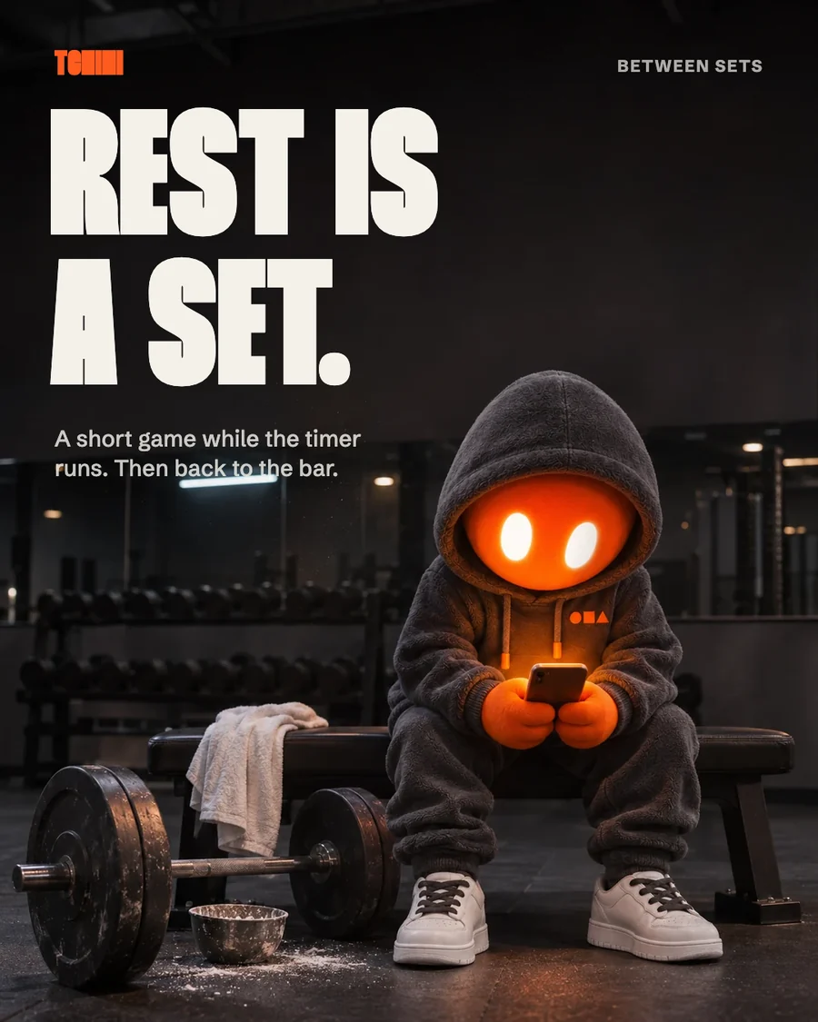
Tchinia real iOS appTwo directions on one idea, rest, each taken from one of the studies. A, After the set: a real gym at night, from BAR’s habit of putting the mascot in a real place. B, One orange: a grid of graphite gym gear where the mascot is the only orange, from Arôme’s one loud colour. ChatGPT made each scene with the master attached and no text. The words were set in Thunder afterwards, in Claude Design.
Made for this guide: scenes in ChatGPT with the master attached, type set in Claude Design.
ChatGPT promptDirection A: After the setAttach mascot-master-v2. 4:5. Leave the top clear for the words.
The attached image is the identity lock: the approved master of an existing mascot. Keep exactly this character: a plush designer-toy figure about three and a half heads tall, a charcoal fleece hoodie with the hood always up, a round signal-orange velvet face with two soft white glowing oval eyes and no mouth, orange mitten-like gloves, the small orange chest emblem of a circle, a square and a triangle, charcoal fleece joggers and chunky white sneakers. Same face, same proportions, same materials. It stays a toy figure, about 60 centimetres tall, inside a real photograph.

A photoreal social media poster. Late at night in a small, empty, real gym, the mascot sits alone on the end of a flat weight bench between two sets, leaning forward with its elbows on its knees, holding a phone in both gloves. The phone screen glows warm orange and lights its face from below. Next to its feet: a loaded barbell resting on the floor with black rubber plates, a scuffed chalk bowl, a white towel over the bench. Behind it, out of focus, a dark rack of dumbbells and a mirror wall catching a few small reflections of the overhead lights.

Composition: portrait 4:5. The mascot and bench sit in the lower half of the frame, slightly right of centre, the full figure visible. The upper 40 percent of the frame is calm, dark, mostly empty gym wall and ceiling in shadow, kept clean for a headline that will be added later.

Camera at the mascot's eye level, a 35 mm look, gentle depth of field so the mascot and bench are sharp and the racks behind fall soft. Light: one cool overhead strip light far behind, low and moody, plus the warm orange glow of the phone on the face and gloves; real contact shadows under the bench and sneakers, a little chalk dust hanging in the light. Colour: deep graphite and near-black everywhere, the only orange in the frame is the mascot's face, its gloves, the emblem and the phone glow.

No text, no letters, no numbers on the phone or anywhere else, no logos, no people, no faces other than the mascot.
ChatGPT promptDirection B: One orangeAttach mascot-master-v2. 4:5. Leave the top clear for the words.
The attached image is the identity lock: the approved master of an existing mascot. Keep exactly this character: a plush designer-toy figure, a charcoal fleece hoodie with the hood always up, a round signal-orange velvet face with two soft white glowing oval eyes and no mouth, orange mitten-like gloves, the small orange chest emblem of a circle, a square and a triangle, charcoal fleece joggers and chunky white sneakers. Same face, same proportions, same materials.

A graphic top-down social media poster built from real objects. Seen straight from above, a black speckled rubber gym floor holds a strict, evenly spaced grid of gym objects, three columns and three rows, each object alone in its square with equal space around it: a black rubber weight plate, a black hex dumbbell, a coiled black skipping rope, a charcoal water bottle, a pair of graphite lifting straps, a grey chalk block, a black resistance band, a graphite stopwatch. In the one remaining square, the centre square of the bottom row, the mascot lies curled on its side on a small folded charcoal towel, resting, its glowing eyes closed into calm half-moons. Every object is black, graphite or grey. The mascot is the only orange thing in the entire image: its face, gloves and emblem.

Composition: portrait 4:5. The three-by-three grid fills the lower two thirds of the frame. The top third is plain empty rubber floor, kept clean for a headline that will be added later.

Camera directly overhead, perfectly square to the floor, everything in sharp focus. Light: soft, even daylight from the top left, small soft shadows under each object, a faint sheen on the rubber plate and the bottle. Clean, calm, precise, like a product catalogue.

No text, no letters, no numbers, no logos, no people, no faces other than the mascot.
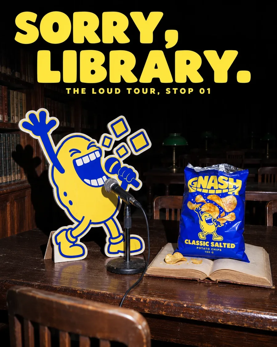
Gnasha chips brandThe Loud Tour: the band as cardboard cut-outs, treated like a real band in a library, a club, on stage, and the morning after. Five posts, one idea, made in ChatGPT with the real bag and band attached. The type is part of the image, so every letter was checked.
ChatGPT promptTour stop promptAttach the bag and the band art. 3:4.
Black and white live concert photograph with selected colour, used as a social media post, portrait 4:5, 1080 x 1350.

Five images are attached, in this order. First image: use only its low, tilted, wide-angle camera position beside a drum kit, its big cymbals in the foreground and its smoke and stage lamps, and copy nobody from it. Second image: use only its photographic treatment, meaning the black and white grain, hard lamps, smoke and flat printed standee look, and copy none of its subject or text. Third image: the exact mascot, a fried chicken drummer jumping above a red snare drum with two drumsticks raised. Keep its face, sleepy eyes, teeth, pose, proportions and colours exactly as drawn, as flat printed artwork, with no redrawing and no 3D, and ignore its dark background. Fourth image: the exact product, one Gnash Fried Chicken potato chip bag, with its shape, printed logo, cartoon drummer, chips and all printed text exact, undistorted and correctly spelled, and ignore its grey background. Fifth image: use only the letter shapes and two-line layout of the words BONES and OPTIONAL. and ignore its black and white colours.

The hardest hit of a drum solo, seen from low beside a real drum kit on a club stage. Sitting behind the kit is a real die-cut cardboard standee of the drummer, about two metres tall, thick matte card with a visible white cut edge and a slight bend in the card, clearly a physical object. Nobody is on stage. Real cymbals, wet with light, fill the near edge of the frame, and a real snare drum sits in the middle of the frame. Golden potato chips and crumbs are jumping up off the snare drum skin as if the last hit launched them, frozen in mid-air around the standee. The bag from the fourth image stands upright on top of a floor tom at the lower right, facing the camera, about one quarter of the frame height, in focus and fully readable. Behind the standee: stage lamps, a mic stand and thick smoke falling into darkness. There is no crowd in this frame.

Shot with an 18mm wide-angle look from low on the stage, the horizon tilted about fifteen degrees, slight curve at the frame edges, f/2.8, focus on the standee, the snare drum and the bag. Light: three hard white stage lamps high behind the standee flare into the lens through thick smoke, one low lamp rakes across the cymbals, with deep blacks, blown highlights and heavy high-ISO grain.

Colour: the entire photograph is pure black and white, except for four things that keep their full true colour: the printed drummer standee, the chip bag, the flying chips and the headline. Everything else, including the drums, cymbals and smoke, stays grey.

The upper left of the frame stays dark for the headline. Flat printed over the photograph, the headline reads exactly BONES on the first line and OPTIONAL. on the second, in red-orange, hex FF330D, in the letter shapes of the fifth image, large, across the upper part of the frame, without covering the drummer's face. In the bottom left corner, small plain spaced capitals read exactly THE LOUD TOUR, STOP 04, in red-orange.

No other text and no extra logos. No people, no hands and no human faces anywhere. The cardboard mascot and the one printed on the bag are the only faces.
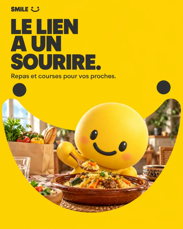
SMILEa family food-ordering appTen directions, one cover each, made with this method: references studied on Behance, a different idea per direction, the master and the logo attached, French copy checked letter by letter. The shortlist: White Launch for reach, Cinéma Maison for family stories, Smile Window for the device that repeats best.
ChatGPT promptDirection 07: Smile WindowAttach a style reference, the master and the logo. 4:5.
Use case: ads-marketing. Create ONE finished original SMILE Instagram carousel COVER, vertical 4:5, 1080 x 1350 or larger. Full bleed, no external rounded corners, no device mockup, no triptych or contact sheet. This is a first-slide art-direction proposal, so composition and typography should feel like a designed campaign, with a clear hierarchy and a deliberate story.
INPUT ROLES: image 1 is a supplied STYLE/COMPOSITION reference only. Borrow its design mechanisms, not its literal artwork, products, people, text, logos, colours or brand assets. Ignore screenshot Save/Permalink UI. Image 2 supplies the SMILE MASCOT IDENTITY ONLY: a large round sunshine-yellow vinyl head, two dark glossy oval eyes, broad dark curved smile, soft orange cheeks, compact small yellow body and rounded limbs. No nose, hair or changed facial design. Change pose as described, preserving recognisable proportions. Any image 3 is a food material/product reference only.
SMILE orders meals and groceries for relatives. It is not a wallet, remittance or mobile-recharge product. Portray thoughtful care through food and everyday delivery. No price, discount, rating, delivery-time guarantee or invented live-service claim.
Brand graphic palette: sunshine yellow #FFCE00, warm cream, charcoal. Food and environmental materials retain natural colours. Neutral silver is allowed as a material, not an extra brand accent. Warm ambient light may create natural amber tones. No purple, neon cyan, red brand fields, copied reference logos or Coca-Cola lettering. All subjects original; no humans or human body parts in this first-round cover.
Typography: make the assigned headline unmistakably dominant and compose it with the scene, not as a generic block above an unrelated image. Use a Bebas Neue-like condensed display and Poppins-like geometric sans, with the treatment specified for this direction. Every supplied French string must be spelled exactly with accents and punctuation. Render each string once. No extra microcopy, fake fine print, numerical badges, watermarks, lorem ipsum or extra brand names. A small original SMILE smile symbol (two dots above one broad U-shaped arc) can accompany the exact SMILE wordmark.
Realism: photographic food and environment materials; the mascot deliberately remains soft vinyl 3D unless otherwise stated. Coherent lighting and contact shadows, no waxy food, no arbitrary smoke. A surreal setup is intentional advertising art direction, not evidence of a real event. Keep all important lettering readable at mobile size with generous edge clearance.

DIRECTION 07 — Smile Window
SUBJECT/ACTION: create an original flat sunshine-yellow graphic field occupying almost the whole 4:5 card. Cut a very large broad U-shaped SMILE arc window through it, not a bottle silhouette and not a copied logo. Through this wide curved opening, reveal a photographic warm home dining-table scene: an earthenware couscous bowl, cream takeaway bag and the familiar yellow vinyl mascot leaning happily toward the bowl. The photo is a unified real-space scene, not separate floating cutouts. There are no people.
ENVIRONMENT/DEPTH: the photographic layer extends edge to edge behind the yellow field and remains visible in a slim outer frame; foreground tablecloth, midground bowl and mascot, softly receding interior. The yellow graphic plane itself is perfectly flat with no bevel or 3D extrusion. The curved aperture acts as a bold brand device that can continue across slides.
CAMERA: 50mm-equivalent table-height photograph behind the aperture. Focus on bowl and mascot face; enough of each visible through the wide opening to read, never hide the eyes in a tiny slit.
LIGHT: broad daylight from camera-left on the photographic scene, warm wall bounce and believable soft shadows. The graphic yellow remains perfectly uniform. Mood: optimistic, intimate, instantly recognisable.
TYPE/COMPOSITION: very small charcoal SMILE at top-left, large bold Poppins headline top-left in three disciplined short lines above the curved opening. Modest support line under headline. Charcoal smile-dot accents within the yellow field, no borrowed bottle outline, script wordmark or red.
TEXT ONLY: "SMILE"; headline "LE LIEN A UN SOURIRE."; support "Repas et courses pour vos proches.".
Your turn
Study real references on Behance. Write the mechanism under each one, not the look.
Design two directions that differ in story, medium and layout, not just colour. Pick one.
Turn the winner into a series: hook, value, proof, close. Then only the content changes.
AvoidThree posts, three layouts. A brand has to repeat itself.
Before you move on
Reads as the brand with the logo covered
One idea per post
Every letter checked at full size
11Step 11 · Phase 4 · Awareness
Website, motion, sound
Give the brand one interaction nobody else has. Then make it move and sound like itself.
OutputA site that tells the idea without words.
Tchinia real iOS appOn the landing page the mascot stands in front of a giant TCHINI wordmark and plays a real rest game. When the rest hits zero, the page floods orange.
Gnasha chips brandThe band plays when you bite, and sound stays off until you choose it. Everything moves on one beat: 120 BPM.
Page from the Gnash brand book.
SMILEa family food-ordering appThe landing leads with the food, not the app: one promise on top, then seven real dishes and baskets in a row. The thing people want is the first thing they see.
Your turn
Find the one interaction that is the idea: a countdown, a bite, a bridge.
Pick one tempo and make everything move on it.
Sound off by default. Let people choose it.
AvoidAnimation as decoration. Every move should say the idea.
12Step 12 · Phase 4 · Awareness
Keep it alive
Decide how the brand grows without a rebrand: what can change every season, and what never changes.
OutputAn evolution rule.
Tchinia real iOS appTen ranks, ten outfits: the mascot gets a new look every five levels, from street clothes to a glowing final form. The anchors never change.
RookieCommittedChalkVarsityFocus
Gnasha chips brandA new tour every year. A new flavour is a new band member, built the same way. The teeth never change.
Page from the Gnash brand book.
SMILEa family food-ordering appA new service is a new prop, never a new character. And because the name is not cleared yet, the rule is that everything can be renamed in an afternoon.
WelcomeMealsGroceriesDelivery
Your turn
Write two lists: what changes every season, and what never changes.
Make the system add, not replace: a new outfit, a new member, a new prop.
Once a year, change only what is weakest.
AvoidRedesigning because you are bored. Change only what is weakest.
How I run Claude Design
Where type has to be exact.
ChatGPT makes the picture. Claude Design is where I set words that must be right: the Tchini posts in step 10, brand boards, labels, decks. Checked in November 2026. Claude Design is still in preview, so menus can move.
Open it. In a Claude chat, choose Output, then Design. In Claude Code, type /design. (The standalone claude.ai/design closes on 14 December 2026.)
Give it the kit, not a vibe. Upload the generated image, the logo, the palette with hex codes and the font files. If the brand lives in code, sync it as a design system with /design-sync, and every new design starts with your colours and type.
Brief one frame at a time. Size, the first, second and third read, the exact words, and what is forbidden. “1080 × 1350. Headline in Thunder across the empty top third. Nothing over the face.”
Fix with comments. Click the element that is wrong and say what to change. Use the chat for bigger moves.
Save your alternatives. There is no version history yet, so ask Claude to save a copy before you try a new direction.
Export. PDF, PPTX, Canva, standalone HTML, or a hand-off to Claude Code to build it. For posting, open it in Canva or export a PDF and save each frame as an image.
The rules I keep
Six rules, every brand.
01Attach the master, every time.A fresh prompt every time is how one mascot becomes a hundred characters.
02Words go in at the layout stage.ChatGPT makes the picture. Claude Design sets the type, so a typo costs a click, not a regeneration.
03Generate several, keep one.Fix drift with a targeted edit. Never polish a weak result.
04Redraw what must stay exact.Logos, wordmarks and anything that animates become vector.
05Take the mechanism, never the picture.Studying a case study is not copying it. Their characters and layouts stay theirs.
06Label what is not real.Gnash is fictional. SMILE is a prototype. Concepts say so on the post.
Studied: Mascot Collection by BAR and Arôme Bakery by WOBL Creative, both on Behance; their work is not reproduced here. Tchini is an app by NOQTA Solutions LLC. Gnash is a fictional example brand by NOQTA, not a real product. SMILE is a prototype designed by NOQTA, and its name is a working name. Images marked “Made for this guide in ChatGPT” were generated with the prompt shown next to them. Some Tchini images are recreations, labelled where they appear.