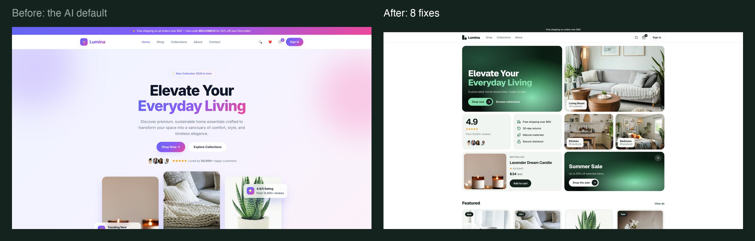
You know the look. A purple-to-pink gradient. Emoji for icons. The same font as every other app. Three buttons fighting for attention, a row of fake stats, a countdown nobody asked for.
That isn’t the AI being bad at design. It’s what happens when you don’t name anything. If your prompt says “make a modern shop”, the model fills every gap with its most common answer. Every gap it fills with an average is a piece of slop.
So I built one shop app, Lumina, in the default AI look, and fixed it one rule at a time. Here are the eight fixes, what each one changes, and what to tell your AI.
- 01Compact it
- 02Pick the font
- 03Name the gradient
- 04Icon library, not emoji
- 05Real photos
- 06One named style
- 07Pill buttons
- 08A real logo
01Compact it.
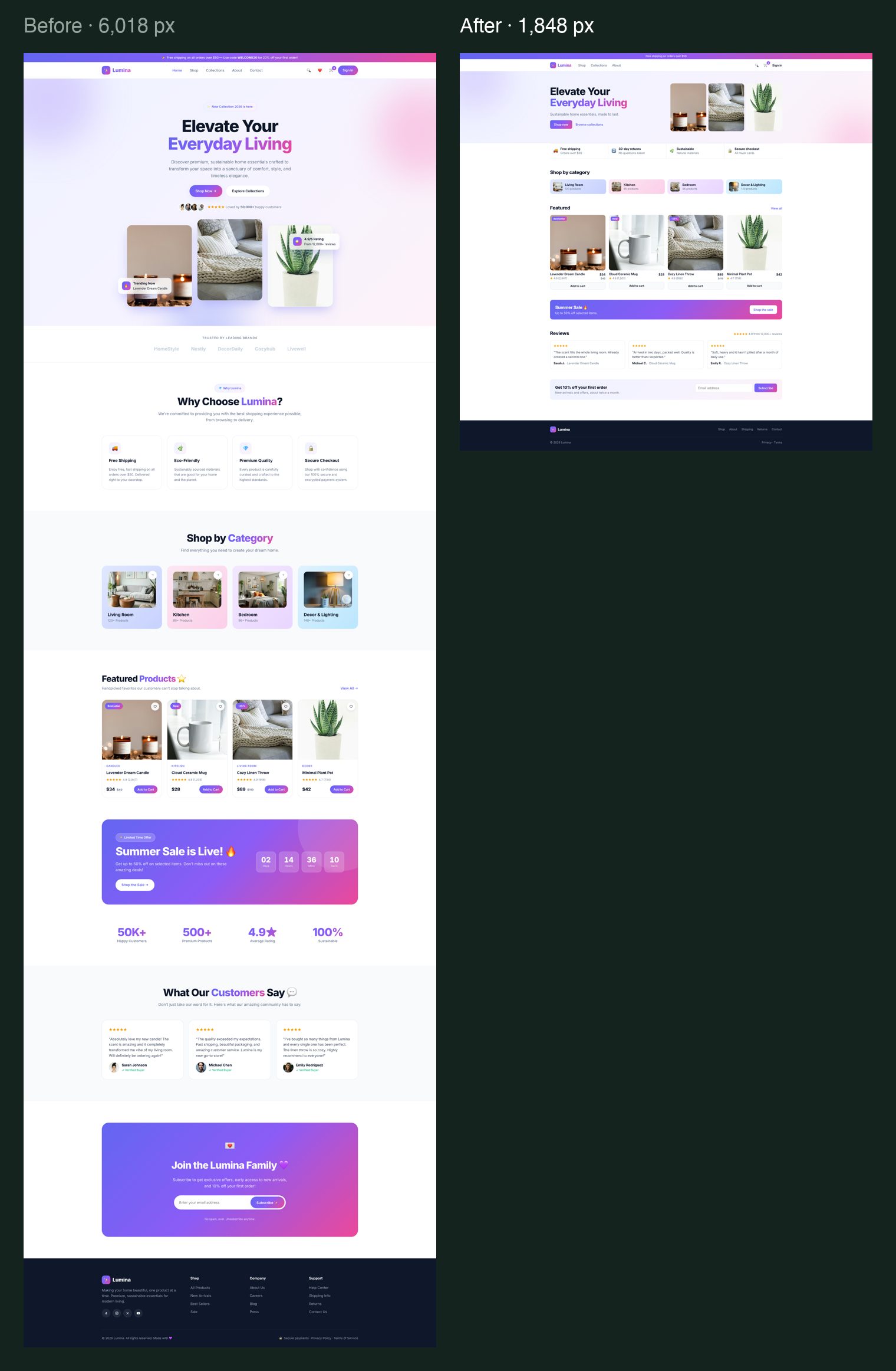
AI loves to stack sections: a logo row, four feature cards, a stats band, a countdown, testimonials, a newsletter, and a second and third call to action. Each one looks fine on its own. Together, your user doesn’t know where to look.
Give every screen one clear action. Cut any section that doesn’t serve that job, tighten the spacing and make the controls smaller. Lumina’s home page went from 6,018 px to 1,848 px tall, about two-thirds less, and it says more.
02Pick the font yourself.
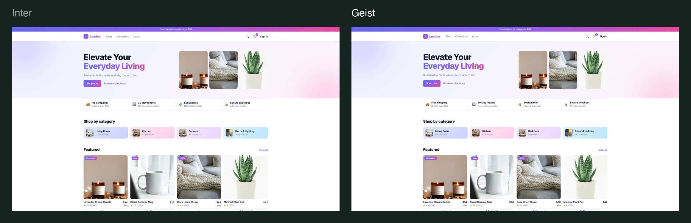
Don’t let the AI pick it. It picks the same safe sans-serif for everyone, and that sameness is half of why AI apps look alike. Inter, Geist, Montserrat and Poppins are all good fonts when you choose them on purpose. For this one I chose Geist.
03Name the gradient.
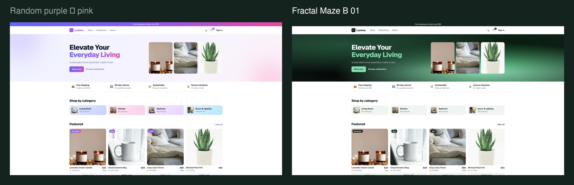
Random gradients scream AI. “Add a gradient” gets you purple into pink every time. Name the style instead: grainy, fractal maze, smooth blend. Use it in one or two places, and take the rest of the palette from it.
The one on Lumina is Fractal Maze B 01, from a gradient library I’m building. Here’s the CSS.
/* Fractal Maze B 01, achref.dev gradient library */
.gradient {
  background-color: #15221d;
  background-image:
    url("data:image/svg+xml,%3Csvg xmlns='http://www.w3.org/2000/svg' width='240' height='240'%3E%3Cfilter id='n'%3E%3CfeTurbulence type='fractalNoise' baseFrequency='.9' numOctaves='3' stitchTiles='stitch'/%3E%3CfeColorMatrix type='saturate' values='0'/%3E%3C/filter%3E%3Crect width='100%25' height='100%25' filter='url(%23n)' opacity='0.25'/%3E%3C/svg%3E"),
    radial-gradient(at 18% 22%, #204a35 0px, transparent 55%),
    radial-gradient(at 78% 18%, #2d6240 0px, transparent 55%),
    radial-gradient(at 70% 78%, #84dead 0px, transparent 55%),
    radial-gradient(at 22% 82%, #0a1410 0px, transparent 55%);
  background-blend-mode: overlay, normal;
}
04Use an icon library, not emoji.
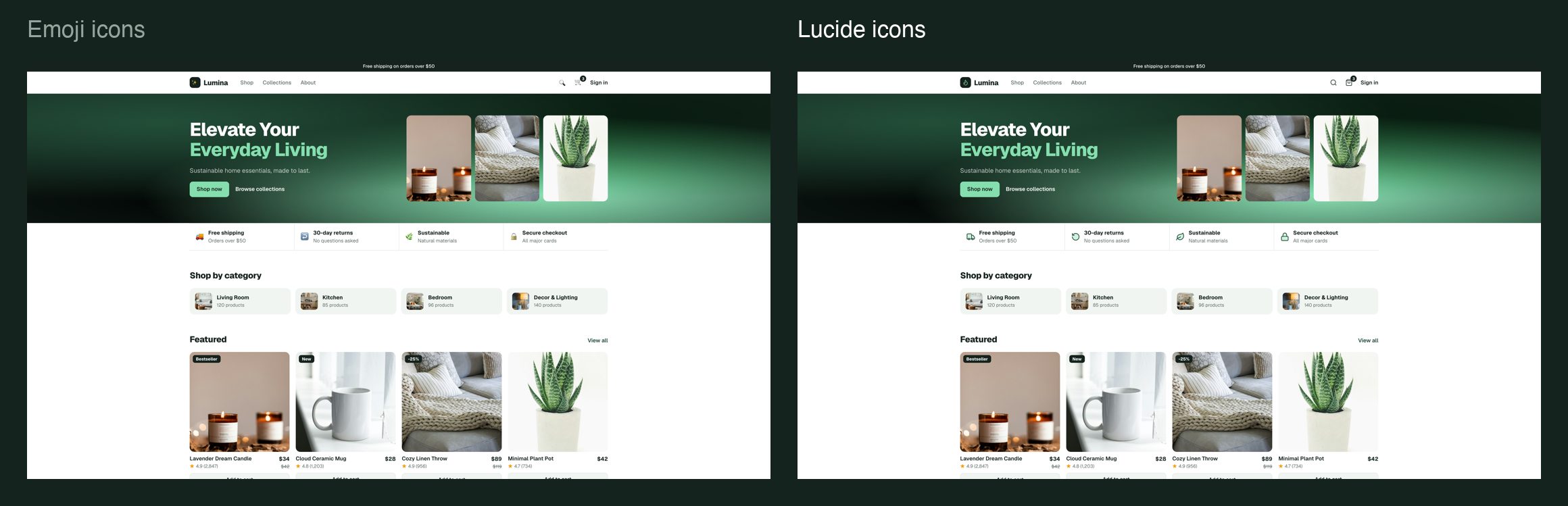
Emoji icons look like a group chat, not a product. Ask for an icon library instead. With one library every icon shares the same stroke and the same grid, so they look like they belong together.
05Use real photos.
Emoji products, gradient blobs and stock 3D shapes make the whole store feel fake. Real photos are free.
06Pick one style, and name it.
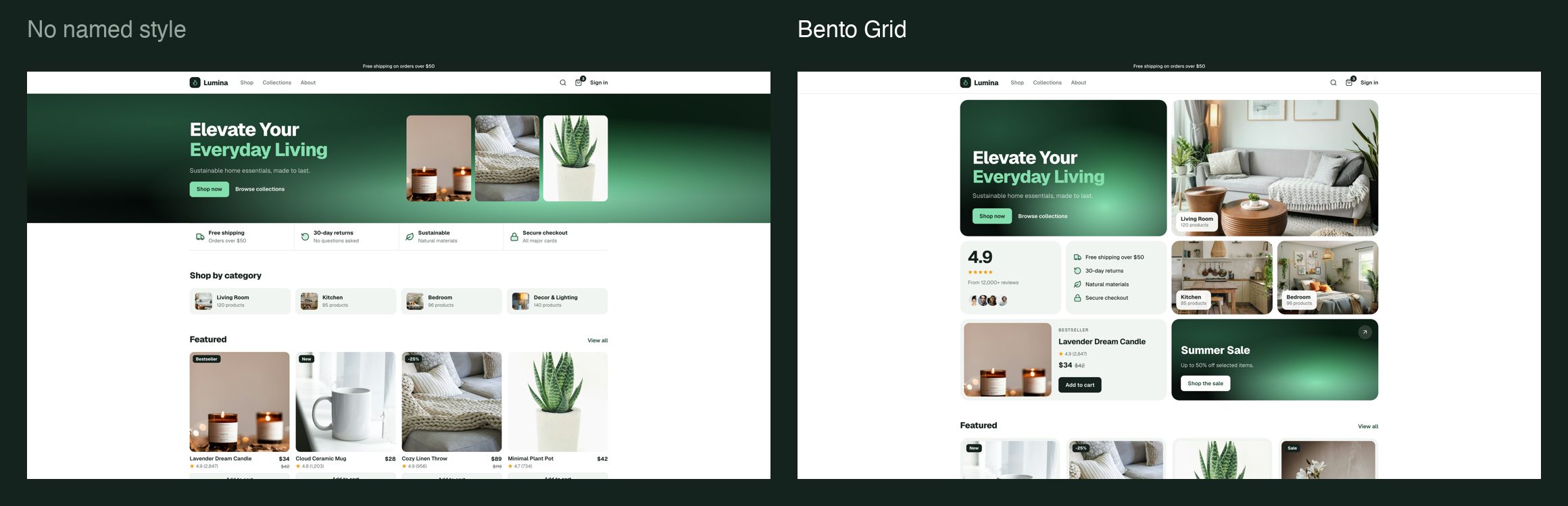
“Modern and clean” isn’t a style. There are more than twenty real ones. Pick one and put its name in your prompt. Tap any style to see an example. To find more, search Pinterest for “[style] website UI design”.
We went with Bento Grid: tiles of different sizes on one grid, with one gap and one corner radius everywhere.
07Pill buttons.
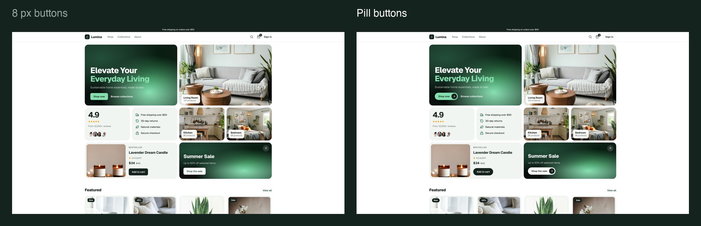
Make buttons full pills. The main call to action gets a small round arrow at the end. One arrow, one job: if a screen has three equal buttons, two of them are probably sections you should have cut in step one.
08A real logo, not a sparkle.
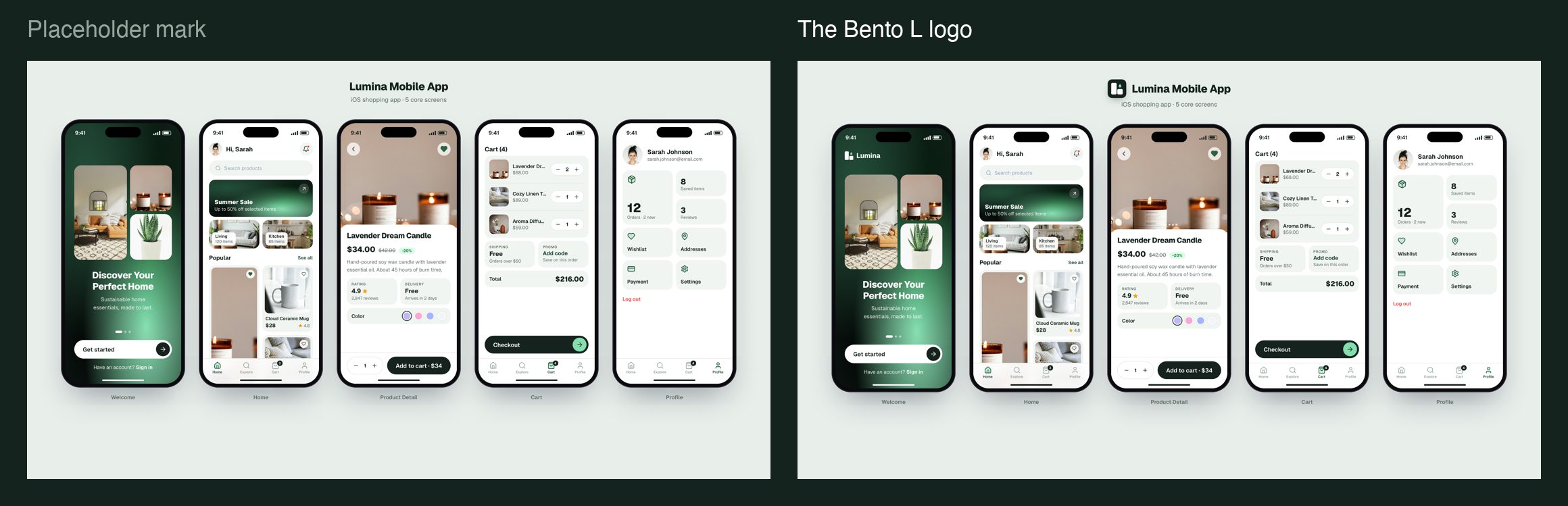
A sparkle emoji next to the name in a gradient is the AI logo. I made Lumina’s mark in ChatGPT with the prompt below, then rebuilt it as an SVG on an exact grid so it stays sharp from an app icon down to 16 pixels.
A flat vector logo mark for "Lumina", a home-goods brand that sells candles, ceramics, throws and lamps. The mark is the capital letter L built from rounded tiles on a 2x2 bento grid, with a candle flame in the empty cell.

Construction: picture a square divided into a 2x2 grid of equal cells with an equal gap between them. The gap is about one eighth of a cell's width. The left column is one tall rounded rectangle that fills both left cells as a single tile. The bottom-right cell is one rounded square tile. Together these two tiles form a bold letter L. The top-right cell has no tile; it holds a single upright candle flame, a smooth symmetric teardrop with a rounded base and a soft pointed tip. Every tile has the same corner radius, about one fifth of a cell's width.

Composition: the mark sits dead center on a plain pure-white square canvas, taking up about 60% of the canvas width. Nothing else is on the canvas.
View: flat, straight-on, orthographic, as if drawn in a vector app. No perspective, no depth.
Lighting: none. Completely flat fills, no shading, no shadows, no glow.
Style: minimal geometric logo design, Swiss precision, the kind of mark that still reads at 16 pixels as an app icon. Solid fills only, three shapes in total.
Colors, exact solid fills: both tiles #15221d. Flame #84dead. Background #ffffff.
Square 1:1 image.
Avoid: gradients, textures, 3D, bevels, outlines, drop shadows, glow, mockups, extra icons, sparkles, and any lettering or text.
The exact prompt.
Everything above in one prompt. Replace the parts in brackets with your own choices. The point isn’t these exact choices, it’s that you make them.
Redesign [my app / my website] for [what it is and who it's for].
Follow these rules exactly. Don't add anything I didn't ask for.

1. Layout: compact. One clear primary action per screen.
   No stats bands, logo rows, countdowns, testimonial walls or second CTAs
   unless I ask for them. Tight, consistent spacing; smaller controls.
2. Style: [Bento Grid]. Tiles of different sizes on one grid,
   one gap and one corner radius everywhere.
3. Font: [Geist] for headings and body. No other font.
4. Gradient: only [Fractal Maze], used in at most two places
   (the hero and one promo). Everything else is solid colour taken from it.
   No purple-to-pink gradients, no gradient text, no blurred blobs.
5. Icons: [Lucide] only. No emoji anywhere in the interface.
6. Images: real photos (Pexels or Unsplash). No emoji or shapes
   standing in for products or people.
7. Buttons: pill shaped (full radius). The main call to action
   ends in a small round arrow. One button, one job.
8. Logo: use [my SVG logo]. Never a sparkle emoji or a gradient wordmark.

Before you finish, list every gradient, emoji, extra font and extra
section you used, and remove anything that breaks these rules.
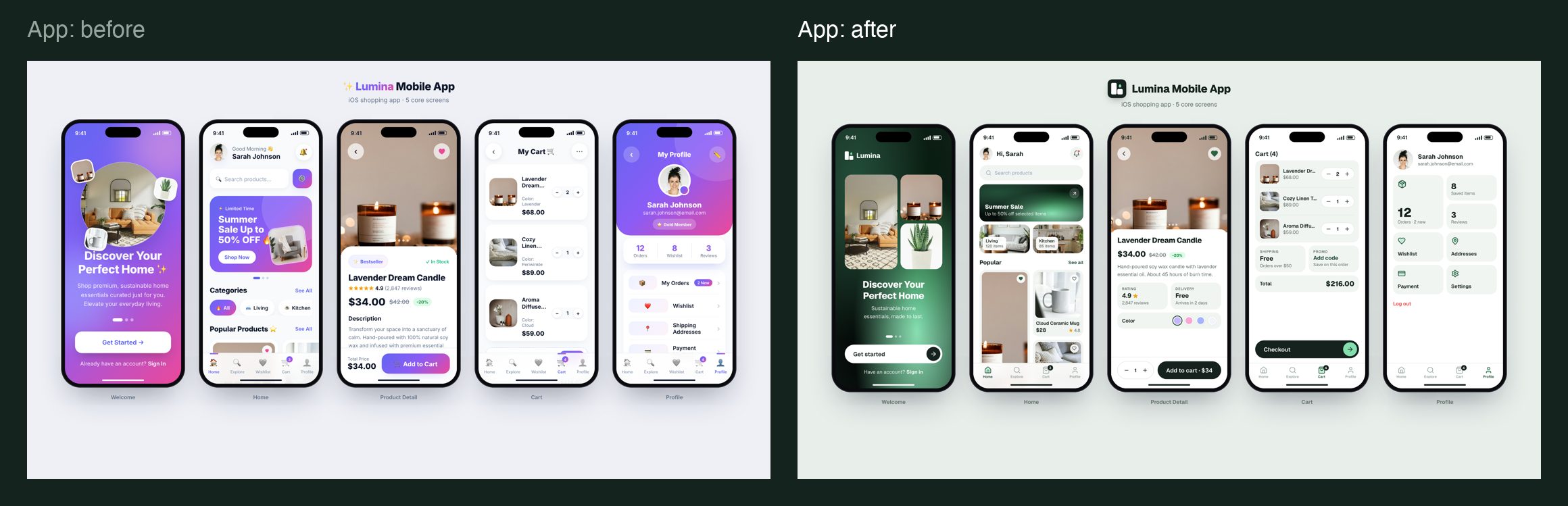
Lumina is an example project built for this guide. Photos from Unsplash; icons from Lucide. The style references on Pinterest belong to their designers.