Ask an AI for “a modern website” and you get the same site everyone gets: a purple gradient, centred everything, three feature cards, glowing buttons. The model isn’t bad at design. It fills every decision you didn’t make with the most common answer, and the most common answer is the AI look.
A style name changes that. Each one below is a real design language with its own type, colour, surfaces and motion. I wrote one prompt template per style, the same way I brief a website for a client, so the model has to make the decisions a designer would make instead of guessing.
How to use them
- Pick the style that fits your needs. Each one says what it’s good for, and when to skip it.
- Copy its prompt.
- Replace everything in [brackets]: what you’re building, who it’s for, the one thing a visitor must do, and your real content. The fonts and colours in brackets are my picks. Keep them or swap them for yours.
- Paste it into Claude, ChatGPT, Cursor, Lovable, v0 or any tool that builds websites. Build one page first and look at it on your phone before asking for more.
How every prompt is built
All 22 follow the same brief, in the same order. Each line is there because leaving it out is exactly where the AI look comes back in.
- Who and the one action
- AI designs for everyone when you don’t say who it’s for, and it adds three buttons when you don’t say which one matters.
- One idea
- One sentence about the image the site should leave in someone’s head. Every other line serves it.
- Layout
- Where things sit. Left to guess, the model stacks the same centred sections every AI site has.
- Type
- A font for each job: headings, body, labels. If you don’t pick, you get the same default as everyone else.
- Colour
- A small palette with a job for each colour. The accent is for the primary action only.
- Surfaces
- One recipe for corners, borders, shadows and textures, used everywhere. Mixed recipes are the fastest way to look generated.
- Images
- What kind, how they are lit and cropped. Real photos or one consistent 3D look, never emoji or random blobs.
- Motion
- One main move and at most two small ones. When everything animates, nothing feels important.
- Phone
- What changes at 390px. Most people will see your site on a phone first.
- Never
- The clichés of that style. Every style has its own AI tells, and naming them is how you avoid them.
- Check
- The model reviews its own work against the list before it hands it back. It catches a surprising amount.
Here is the empty frame. Fill it in to write your own style prompt.
Build [a one-page website / a landing page] for [what it is], for [who it's for].
The one thing a visitor must do: [book / buy / sign up / get in touch].
Sections, in this order: [hero, …, contact]. Use my real content: [paste it here, or write: "write it short and specific, no buzzwords"].

Style: [Style name]. Commit to it on every screen. Don't blend it with any other style.

The idea: [the one image this site should leave in someone's head].
Layout: [how the hero and sections are arranged].
Type: [font] for headings, [font] for body, [optional font] for labels.
Colour: [background], [text], [one accent for the primary action].
Surfaces: [radius, borders, shadows, textures: one recipe used everywhere].
Images: [real photos / 3D / illustration, and how they are lit and cropped].
Motion: one main move: [the one thing that moves]. Supporting: [at most two small interactions]. Nothing else moves.
Phone (390px wide): [what changes at 390px wide].
Never: [the clichés of this style you don't want].

Rules for every screen:
- One primary action per screen. Every button says what it does.
- Real text in HTML, never text baked into images. Body text at least 16px, contrast at least 4.5:1.
- Icons from [Lucide] only. No emoji anywhere in the interface.
- No invented stats, client logos, reviews or countdowns.
- With prefers-reduced-motion, skip the motion and show the final state.

Before you finish, check your work and fix anything that fails:
- [the two or three things that make this style right]
- Every rule above.
The 22 prompts.
01Claymorphism
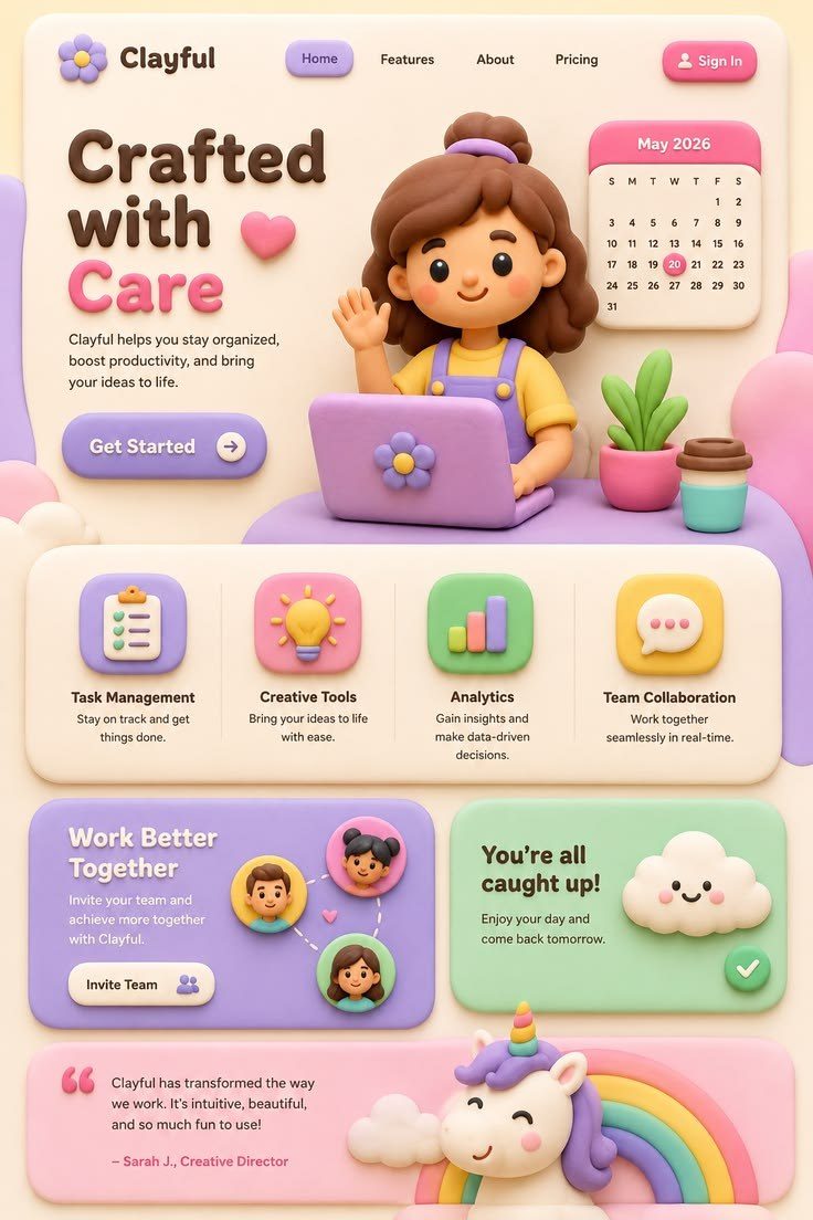
Use it forKids, games, wellness and friendly apps that should feel soft and safe to touch.
Skip it ifYou sell to banks, lawyers or anything that has to feel serious.
Build [a one-page website / a landing page] for [what it is], for [who it's for].
The one thing a visitor must do: [book / buy / sign up / get in touch].
Sections, in this order: [hero, …, contact]. Use my real content: [paste it here, or write: "write it short and specific, no buzzwords"].

Style: Claymorphism. Commit to it on every screen. Don't blend it with any other style.

The idea: everything looks like soft, inflated modelling clay you could press with a finger.
Layout: a centred hero with one large 3D clay object beside the headline, then floating cards with generous space (at least 32px) between them. Few elements per section.
Type: [Fredoka] semi-bold for headings, [Nunito] for body. Rounded letterforms only. Headings 48–72px, tight but never touching.
Colour: a pale base [#F4EEFF], three pastel accents [#FFB8D9 pink, #A8E6CF mint, #B5C7FF periwinkle], text in a deep plum [#2B2340], never pure black. The primary button is the strongest pastel.
Surfaces: corner radius 28–40px on everything. Every card uses the same three shadows: a soft drop shadow (0 18px 40px at 18% opacity), an inner highlight at the top left (inset 6px 6px 12px white at 70%) and an inner shade at the bottom right (inset -8px -8px 16px black at 8%). No borders.
Images: matte 3D clay renders (Spline, Blender or an image model: "matte clay 3D object, soft studio light from the top left, pastel"), one per section, all lit from the same side.
Motion: one main move: the hero object floats 6–8px up and down on a slow 4-second loop. Supporting: buttons squash to 96% when pressed and spring back; cards rise 4px on hover. Nothing else moves.
Phone (390px wide): the clay object sits above the headline, cards stack in one column, keep the same radius and shadows.
Never: glass blur, neon, hard black borders, flat cards without the inner shadows, more than three accent colours.

Rules for every screen:
- One primary action per screen. Every button says what it does.
- Real text in HTML, never text baked into images. Body text at least 16px, contrast at least 4.5:1.
- Icons from [Lucide] only. No emoji anywhere in the interface.
- No invented stats, client logos, reviews or countdowns.
- With prefers-reduced-motion, skip the motion and show the final state.

Before you finish, check your work and fix anything that fails:
- Every card uses the same shadow recipe.
- All 3D objects are lit from the same direction.
- Body text on pastel still passes 4.5:1.
- Every rule above.
02Cybercore
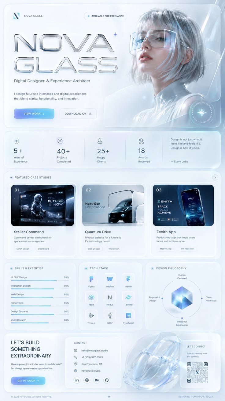
Use it forTech launches, music, gaming gear and products that want early-2000s tech nostalgia.
Skip it ifYour audience needs calm, plain reading.
Build [a one-page website / a landing page] for [what it is], for [who it's for].
The one thing a visitor must do: [book / buy / sign up / get in touch].
Sections, in this order: [hero, …, contact]. Use my real content: [paste it here, or write: "write it short and specific, no buzzwords"].

Style: Cybercore. Commit to it on every screen. Don't blend it with any other style.

The idea: early-2000s tech optimism: chrome, glass and electric blue, like a futuristic operating system from 2001.
Layout: a full-width hero with a chrome 3D object on a deep blue field, a thin wireframe grid behind it, then panels arranged like windows of a desktop interface.
Type: [Michroma] for headings in uppercase, [Space Grotesk] for body, [JetBrains Mono] for small labels and data.
Colour: deep navy [#020B1F] background, electric blue [#1E6BFF], cyan [#00E5FF] for highlights only, chrome greys [#C9D1DC to #7A8594]. No warm colours.
Surfaces: glass panels with a 1px cyan border at 40% and a faint inner glow; buttons are chrome pills (silver gradient with a 1px white top highlight). Thin 1px grid lines at 8% opacity.
Images: chrome and glass 3D objects (spheres, rings, butterflies, stars), wireframe globes, star fields. Product photos get a cool blue grade.
Motion: one main move: the chrome hero object turns slowly as you scroll. Supporting: a light glint passes over a button on hover; a single scanline sweeps a heading when it enters. Nothing else moves.
Phone (390px wide): the chrome object shrinks above the headline, window panels stack full width, keep the grid lines.
Never: pastels, purple-to-pink gradients, rounded friendly fonts, more than two glowing colours, glow on body text.

Rules for every screen:
- One primary action per screen. Every button says what it does.
- Real text in HTML, never text baked into images. Body text at least 16px, contrast at least 4.5:1.
- Icons from [Lucide] only. No emoji anywhere in the interface.
- No invented stats, client logos, reviews or countdowns.
- With prefers-reduced-motion, skip the motion and show the final state.

Before you finish, check your work and fix anything that fails:
- Chrome looks like metal (light top, dark bottom), not flat grey.
- Cyan is used only for highlights.
- Uppercase is limited to headings and labels.
- Every rule above.
03Neo-Brutalism
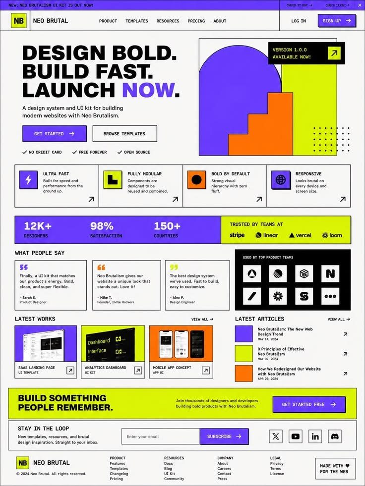
Use it forStartups, creators, tools for designers and brands that want to look confident and fun.
Skip it ifYour brand is luxury or quiet.
Build [a one-page website / a landing page] for [what it is], for [who it's for].
The one thing a visitor must do: [book / buy / sign up / get in touch].
Sections, in this order: [hero, …, contact]. Use my real content: [paste it here, or write: "write it short and specific, no buzzwords"].

Style: Neo-Brutalism. Commit to it on every screen. Don't blend it with any other style.

The idea: loud, honest and blocky: thick black outlines, hard offset shadows and flat bright colour, like a sticker sheet.
Layout: a visible, blocky grid. A huge headline with one word on a coloured highlight block, chunky cards, small badges and stickers rotated between -4° and 4°.
Type: [Archivo Black] for headings, [Space Grotesk] for body and buttons. Big, heavy and tight.
Colour: cream background [#FFF8E7], pure black for lines and text, four flat brights [#FFE45E yellow, #FF6FB5 pink, #5B8CFF blue, #4ADE80 green]. Each section owns one bright.
Surfaces: every box and button has a 3px solid black border and a hard shadow (6px 6px 0 black, no blur). Radius 0–8px. The press state moves the element 4px down-right and removes its shadow.
Images: real photos inside black-bordered frames, cut-out product shots, simple flat icons with black strokes.
Motion: one main move: buttons and cards physically press in (shadow collapses) on click. Supporting: a marquee strip of keywords between sections; cards tilt 1° on hover. Nothing else moves.
Phone (390px wide): one column, borders and hard shadows stay, stickers move inside the content width so nothing overflows.
Never: soft blurred shadows, gradients, thin grey 1px borders, glass, pastel tints.

Rules for every screen:
- One primary action per screen. Every button says what it does.
- Real text in HTML, never text baked into images. Body text at least 16px, contrast at least 4.5:1.
- Icons from [Lucide] only. No emoji anywhere in the interface.
- No invented stats, client logos, reviews or countdowns.
- With prefers-reduced-motion, skip the motion and show the final state.

Before you finish, check your work and fix anything that fails:
- Every shadow is hard (zero blur) and offset the same way.
- Borders are the same 3px everywhere.
- Nothing rotated overflows on a phone.
- Every rule above.
04Scrapbook
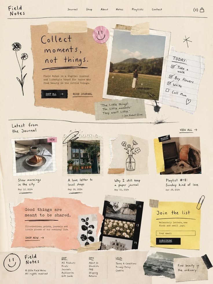
Use it forPersonal brands, travel, food, events, schools and anything with stories and photos.
Skip it ifYou have no photos or the product is a dashboard.
Build [a one-page website / a landing page] for [what it is], for [who it's for].
The one thing a visitor must do: [book / buy / sign up / get in touch].
Sections, in this order: [hero, …, contact]. Use my real content: [paste it here, or write: "write it short and specific, no buzzwords"].

Style: Scrapbook. Commit to it on every screen. Don't blend it with any other style.

The idea: a handmade page: photos, paper scraps, tape and handwritten notes pinned slightly crooked.
Layout: an organic collage. Items overlap a little and each sits at its own small rotation (-4° to 4°). One clear reading path from top to bottom, never a random pile.
Type: [DM Serif Display] for headings, [Work Sans] for body, [Caveat] only for short handwritten notes and arrows.
Colour: warm paper [#F4EBDD] background, ink [#2A2522] text, tape colours [#F7C873 yellow, #E89F9F rose], one accent for the primary button.
Surfaces: photos printed with a white border like instant prints, torn-paper edges (SVG masks), strips of tape over corners, a paper grain texture at 6% opacity over everything.
Images: real photos, plus cut-out objects with a white sticker outline. No stock 3D.
Motion: one main move: items drop onto the page and settle with a small rotation as they scroll in. Supporting: a handwritten underline draws itself under one key word; tape lifts slightly on hover. Nothing else moves.
Phone (390px wide): fewer overlaps, photos almost full width, rotations reduced to ±2°, notes placed under the photo they belong to.
Never: perfect alignment everywhere, glossy app chrome, gradients, pure white background, handwriting for body text.

Rules for every screen:
- One primary action per screen. Every button says what it does.
- Real text in HTML, never text baked into images. Body text at least 16px, contrast at least 4.5:1.
- Icons from [Lucide] only. No emoji anywhere in the interface.
- No invented stats, client logos, reviews or countdowns.
- With prefers-reduced-motion, skip the motion and show the final state.

Before you finish, check your work and fix anything that fails:
- Handwriting is used only for short notes.
- The reading order is still obvious.
- Rotations differ per item but stay small.
- Every rule above.
05Surrealism
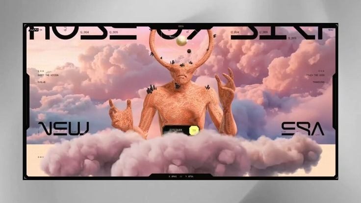
Use it forArt, fashion, music releases, perfume, studios and campaigns built on one strong image.
Skip it ifPeople come to compare features or read a lot of text.
Build [a one-page website / a landing page] for [what it is], for [who it's for].
The one thing a visitor must do: [book / buy / sign up / get in touch].
Sections, in this order: [hero, …, contact]. Use my real content: [paste it here, or write: "write it short and specific, no buzzwords"].

Style: Surrealism. Commit to it on every screen. Don't blend it with any other style.

The idea: a dream scene: one impossible image (a giant moon in a living room, stairs into the sky) carries the page.
Layout: the image is the stage, full screen. Very little text, placed where the image leaves calm space. Sections are separate scenes, not cards.
Type: [Instrument Serif] italic for headings, [Inter Tight] for body and labels. Small, elegant, lots of air around it.
Colour: taken from the images: dreamy sky [#D9C7E8], sand [#E9D8C4], deep blue [#1C2541]. Text colour picked per scene for contrast.
Surfaces: almost none: no cards, no shadows. A thin hairline or a small pill button is enough.
Images: photo-montages or generated scenes with one impossible element each and consistent light and grain across every scene ("surreal photograph, one impossible object at a giant scale, soft natural light, film grain").
Motion: one main move: slow parallax between three layers of the scene (background, subject, foreground). Supporting: one object floats gently; text appears through a soft mask. Nothing else moves.
Phone (390px wide): a separate vertical crop of each scene with the subject centred, text in the calm area at the bottom.
Never: UI clutter, rows of cards, icon grids, stock illustrations, more than one surreal idea per scene.

Rules for every screen:
- One primary action per screen. Every button says what it does.
- Real text in HTML, never text baked into images. Body text at least 16px, contrast at least 4.5:1.
- Icons from [Lucide] only. No emoji anywhere in the interface.
- No invented stats, client logos, reviews or countdowns.
- With prefers-reduced-motion, skip the motion and show the final state.

Before you finish, check your work and fix anything that fails:
- Each scene has exactly one impossible element.
- Text sits on a calm area and passes contrast.
- The phone uses a real vertical crop, not a squeezed image.
- Every rule above.06Y2K Aesthetic
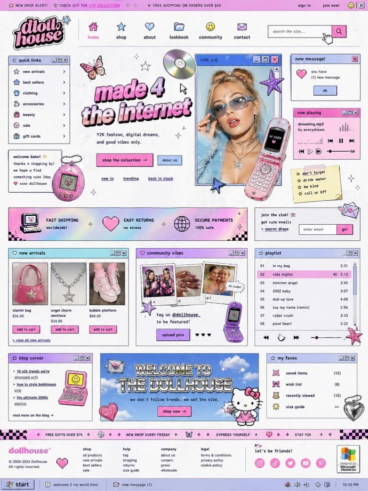
Use it forFashion, beauty, music, Gen Z products and playful launches.
Skip it ifYou need a calm, trustworthy, corporate feel.
Build [a one-page website / a landing page] for [what it is], for [who it's for].
The one thing a visitor must do: [book / buy / sign up / get in touch].
Sections, in this order: [hero, …, contact]. Use my real content: [paste it here, or write: "write it short and specific, no buzzwords"].

Style: Y2K Aesthetic. Commit to it on every screen. Don't blend it with any other style.

The idea: the year 2000 internet: glossy bubbles, iridescent stickers, pixel type and pop-up windows.
Layout: a playful hero with a big glossy word, sticker elements around it, and content inside retro "window" frames with title bars.
Type: [Syne] extra-bold for headings, [DM Sans] for body, [Silkscreen] for tiny pixel labels and tags.
Colour: baby pink [#FFB3DE], baby blue [#A6D8FF], lilac [#CBB6FF], chrome silver, white. Iridescent gradients only on stickers, never behind text.
Surfaces: glossy pill buttons with a white highlight ellipse on top, window frames with a blue title bar and small square buttons, sticker shapes (stars, hearts, butterflies) with a white outline.
Images: flash photography portraits and products, chrome hearts and stars, iridescent 3D bubbles.
Motion: one main move: stickers twinkle and bob in place. Supporting: buttons bounce on hover; a tiny marquee of text runs in one band. Nothing else moves.
Phone (390px wide): stickers shrink and sit around the headline, windows stack full width, keep the pixel labels.
Never: muted earth tones, editorial serifs, iridescence behind body text, more than one pixel font.

Rules for every screen:
- One primary action per screen. Every button says what it does.
- Real text in HTML, never text baked into images. Body text at least 16px, contrast at least 4.5:1.
- Icons from [Lucide] only. No emoji anywhere in the interface.
- No invented stats, client logos, reviews or countdowns.
- With prefers-reduced-motion, skip the motion and show the final state.

Before you finish, check your work and fix anything that fails:
- Iridescence stays on decoration only.
- Body text is plain and readable.
- Stickers never cover a button.
- Every rule above.
07Pixel Art
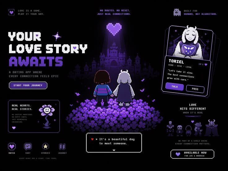
Use it forGames, dev tools, hackathons, retro brands and anything playful for builders.
Skip it ifYour content is long reading or very formal.
Build [a one-page website / a landing page] for [what it is], for [who it's for].
The one thing a visitor must do: [book / buy / sign up / get in touch].
Sections, in this order: [hero, …, contact]. Use my real content: [paste it here, or write: "write it short and specific, no buzzwords"].

Style: Pixel Art. Commit to it on every screen. Don't blend it with any other style.

The idea: an interface straight out of a retro game: chunky pixels, dialog boxes and sprites.
Layout: an 8px grid for everything. A hero with a pixel scene and a dialog box for the headline, menus that look like game menus, stats shown as health bars.
Type: [Pixelify Sans] for headings, [Space Mono] for body so reading stays easy. Pixel fonts only at their designed sizes, never stretched.
Colour: one limited palette of at most 16 colours (for example PICO-8: [#1D2B53, #7E2553, #008751, #FFA300, #FFEC27, #29ADFF, #FF77A8, #FFF1E8]). No colours outside it.
Surfaces: square corners, borders built from 4px pixel steps, buttons with a pixel bevel (light top-left, dark bottom-right). No radius, no blur.
Images: pixel sprites and scenes made at a small size and scaled up by whole numbers (2x, 3x, 4x) with image-rendering: pixelated. Never smooth-scaled.
Motion: one main move: the hero sprite plays an idle animation at about 8 frames per second, in steps. Supporting: buttons move 4px down when pressed; dialog text types in letter by letter. Nothing else moves.
Phone (390px wide): scale sprites by a whole number that fits, one column of dialog boxes, keep the 8px grid.
Never: blurry scaled pixels, gradients, rounded corners, mixing pixel sizes, a pixel font for long paragraphs.

Rules for every screen:
- One primary action per screen. Every button says what it does.
- Real text in HTML, never text baked into images. Body text at least 16px, contrast at least 4.5:1.
- Icons from [Lucide] only. No emoji anywhere in the interface.
- No invented stats, client logos, reviews or countdowns.
- With prefers-reduced-motion, skip the motion and show the final state.

Before you finish, check your work and fix anything that fails:
- Every sprite is scaled by a whole number.
- Every colour is from the palette.
- Long text is in the readable font.
- Every rule above.
08Synthwave
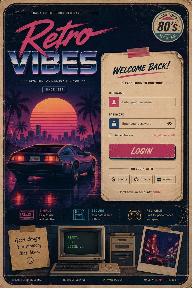
Use it forMusic, events, nightlife, gaming and retro-futurist products.
Skip it ifThe page is used in daylight for serious work.
Build [a one-page website / a landing page] for [what it is], for [who it's for].
The one thing a visitor must do: [book / buy / sign up / get in touch].
Sections, in this order: [hero, …, contact]. Use my real content: [paste it here, or write: "write it short and specific, no buzzwords"].

Style: Synthwave. Commit to it on every screen. Don't blend it with any other style.

The idea: an 80s night drive: neon on dark, a striped sunset and a glowing grid floor running to the horizon.
Layout: a hero scene with the sun on the horizon and a perspective grid floor, headline above the sun. Content below on dark panels with neon edges.
Type: [Monoton] only for the logo or one hero word, [Exo 2] bold italic for headings, [Inter] for body.
Colour: night [#140A2E] background, magenta [#FF2EA6], cyan [#2DE2E6], the sunset gradient (orange [#FF9E45] to pink [#FF2E97]) used only on the sun.
Surfaces: dark panels with a 1–2px neon edge and a soft outer glow. Glow only on accents and edges, never on paragraphs.
Images: one hero scene: striped sun, grid floor, palm or mountain silhouettes, maybe a chrome car. Photos get a magenta and cyan grade.
Motion: one main move: the grid floor scrolls towards the viewer in a slow loop. Supporting: neon edges flicker once when they appear; buttons glow brighter on hover. Nothing else moves.
Phone (390px wide): the sun and grid stay as the hero background, headline on top, panels stack, glow reduced so text stays sharp.
Never: a light background, glow on body text, more than two neon colours, the sunset gradient used anywhere except the sun.

Rules for every screen:
- One primary action per screen. Every button says what it does.
- Real text in HTML, never text baked into images. Body text at least 16px, contrast at least 4.5:1.
- Icons from [Lucide] only. No emoji anywhere in the interface.
- No invented stats, client logos, reviews or countdowns.
- With prefers-reduced-motion, skip the motion and show the final state.

Before you finish, check your work and fix anything that fails:
- Only two neon colours.
- Paragraphs have no glow and pass contrast.
- The grid loop is smooth and stops with reduced motion.
- Every rule above.
09Glassmorphism
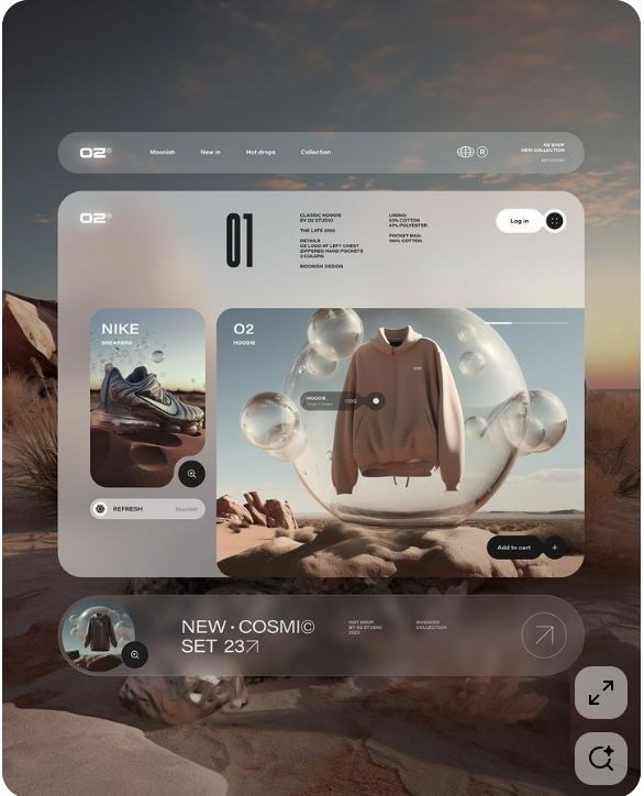
Use it forApps, fintech, dashboards, music and modern product pages with a colourful brand.
Skip it ifYour background has to be plain white (glass disappears on white).
Build [a one-page website / a landing page] for [what it is], for [who it's for].
The one thing a visitor must do: [book / buy / sign up / get in touch].
Sections, in this order: [hero, …, contact]. Use my real content: [paste it here, or write: "write it short and specific, no buzzwords"].

Style: Glassmorphism. Commit to it on every screen. Don't blend it with any other style.

The idea: frosted glass panels floating over rich colour, like looking through a window on a rainy evening.
Layout: a vivid background (soft colour blobs or a photo) with two depth levels of glass on top: the main panels, and small chips or controls on them. Never glass on glass on glass.
Type: [Satoshi] or [Inter] for everything, two weights only. White text on dark glass, deep ink on light glass.
Colour: a vivid backdrop of two or three hues [#7F5AF0, #2CB1BC, #FF8E3C], panels as white at 12–20% fill. Choose one accent for the primary action.
Surfaces: backdrop-filter: blur(20px) saturate(140%); a 1px border in white at 35%; a brighter top edge; radius 24px; a soft shadow below. If backdrop-filter is not supported, fall back to a solid tinted fill.
Images: colourful photos or abstract blobs behind the glass, so the blur has something to frost.
Motion: one main move: the background colours drift very slowly (about 20 seconds per loop). Supporting: panels tilt up to 4° towards the pointer; buttons press in like liquid (squash and spring back). Nothing else moves.
Phone (390px wide): smaller blur radius for speed, panels full width, keep the two depth levels.
Never: glass on a white background, text over a busy area without a stronger fill behind it, more than two depth levels, purple-to-pink defaults.

Rules for every screen:
- One primary action per screen. Every button says what it does.
- Real text in HTML, never text baked into images. Body text at least 16px, contrast at least 4.5:1.
- Icons from [Lucide] only. No emoji anywhere in the interface.
- No invented stats, client logos, reviews or countdowns.
- With prefers-reduced-motion, skip the motion and show the final state.

Before you finish, check your work and fix anything that fails:
- Every text block on glass passes 4.5:1.
- There is a solid fallback without backdrop-filter.
- The page scrolls smoothly on a phone.
- Every rule above.
10Neumorphism
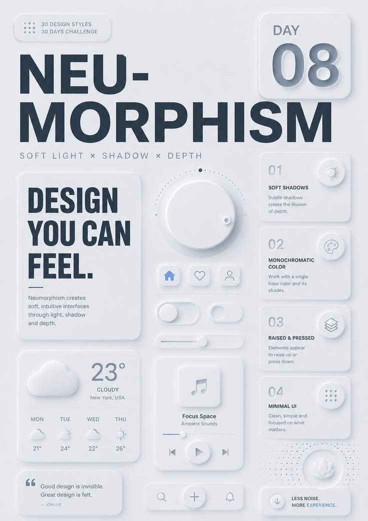
Use it forSmart-home controls, calculators, music players and small focused tools.
Skip it ifYou need many sections of reading or strong contrast for older users.
Build [a one-page website / a landing page] for [what it is], for [who it's for].
The one thing a visitor must do: [book / buy / sign up / get in touch].
Sections, in this order: [hero, …, contact]. Use my real content: [paste it here, or write: "write it short and specific, no buzzwords"].

Style: Neumorphism. Commit to it on every screen. Don't blend it with any other style.

The idea: controls pushed out of, and pressed into, one soft surface, like moulded plastic.
Layout: few, large controls on one background colour, laid out like a physical device. Each group of controls on its own raised plate.
Type: [Manrope] for everything. Darker text than the style usually uses, so it stays readable.
Colour: one surface colour [#E6E9EF] for the whole page, text [#2D3440], one accent [#4F7CFF] for active and primary states only.
Surfaces: raised: 8px 8px 16px [#C5C9D3] plus -8px -8px 16px white. Pressed: the same two shadows set to inset. Radius 20–28px. No borders.
Images: very few. Simple line icons and maybe one product render on the same surface colour.
Motion: one main move: controls switch between raised and pressed in 150ms when used. Supporting: knobs and sliders spring to their new value. Nothing else moves.
Phone (390px wide): controls become a single column of large touch targets (at least 48px), plates stay raised.
Never: low-contrast grey text, more than one surface colour, state shown only by shadow (always add the accent colour or an icon change), dark mode copies of the light shadows.

Rules for every screen:
- One primary action per screen. Every button says what it does.
- Real text in HTML, never text baked into images. Body text at least 16px, contrast at least 4.5:1.
- Icons from [Lucide] only. No emoji anywhere in the interface.
- No invented stats, client logos, reviews or countdowns.
- With prefers-reduced-motion, skip the motion and show the final state.

Before you finish, check your work and fix anything that fails:
- Every control shows its state with colour or an icon, not only shadow.
- Text passes 4.5:1 on the surface colour.
- Touch targets are at least 48px.
- Every rule above.
11Bento Grid
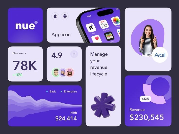
Use it forProduct launches, SaaS, portfolios and feature pages with many short points.
Skip it ifYour page is one long story that needs to be read in order.
Build [a one-page website / a landing page] for [what it is], for [who it's for].
The one thing a visitor must do: [book / buy / sign up / get in touch].
Sections, in this order: [hero, …, contact]. Use my real content: [paste it here, or write: "write it short and specific, no buzzwords"].

Style: Bento Grid. Commit to it on every screen. Don't blend it with any other style.

The idea: every message lives in its own tile, and tiles of different sizes fit together on one grid like a bento box.
Layout: a 12-column grid. One large hero tile (2x2), the rest 1x1 and 2x1. Each tile carries one message: a feature, a number, an image or a quote, never two.
Type: [Geist] for everything. Tile titles 20–24px, at most one big number per tile.
Colour: a neutral background [#F5F5F4], white tiles, one dark tile [#111111] and one accent tile [your brand colour] per grid.
Surfaces: one radius (24px), one gap (12–16px) and one padding (24px) everywhere. A hairline border or a very soft shadow, not both.
Images: real product screenshots and photos cropped to fill their tile, never floating inside it.
Motion: one main move: tiles appear in grid order with a 40ms stagger, once. Supporting: a tile lifts 2px and its image zooms to 103% on hover; one tile plays a small live demo. Nothing else moves.
Phone (390px wide): one column, ordered by importance, 2x1 tiles become full width, the hero tile stays first.
Never: different radii or gaps, two messages in one tile, empty decorative tiles, gradient text.

Rules for every screen:
- One primary action per screen. Every button says what it does.
- Real text in HTML, never text baked into images. Body text at least 16px, contrast at least 4.5:1.
- Icons from [Lucide] only. No emoji anywhere in the interface.
- No invented stats, client logos, reviews or countdowns.
- With prefers-reduced-motion, skip the motion and show the final state.

Before you finish, check your work and fix anything that fails:
- One radius, one gap, one padding everywhere.
- Every tile has exactly one message.
- The phone order follows importance.
- Every rule above.
12Editorial Design
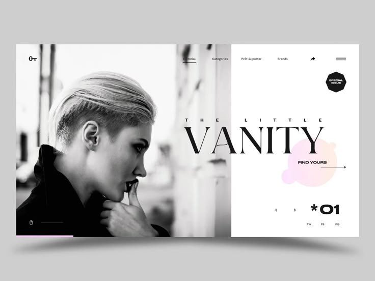
Use it forBlogs, studios, restaurants, culture, publishing and brands with stories to tell.
Skip it ifYour users want quick actions, not reading.
Build [a one-page website / a landing page] for [what it is], for [who it's for].
The one thing a visitor must do: [book / buy / sign up / get in touch].
Sections, in this order: [hero, …, contact]. Use my real content: [paste it here, or write: "write it short and specific, no buzzwords"].

Style: Editorial Design. Commit to it on every screen. Don't blend it with any other style.

The idea: a printed magazine on screen: big headlines, columns, captions and a lot of white space.
Layout: an asymmetric 12-column grid. A huge headline, a deck line under it, a drop cap to start the text, pull quotes that break the column, full-bleed photos with captions. Reading width 60–70 characters.
Type: [Fraunces] for headlines, [Source Serif 4] for body at 18–20px, [Inter] in small caps for labels, dates and captions.
Colour: paper [#FAF7F2], ink [#111111], one accent [#C2410C] for links and the primary action.
Surfaces: no cards and no shadows. Thin 1px rules separate sections, like a magazine.
Images: large editorial photographs with captions and credits, mixed sizes: one full-bleed, then smaller ones in the columns.
Motion: one main move: the headline reveals line by line through a mask, once. Supporting: images move with a light parallax; a thin reading-progress bar at the top. Nothing else moves.
Phone (390px wide): one column, headline still huge but broken by hand, pull quotes full width, captions under photos.
Never: cards with shadows, centred everything, gradients, icons as decoration, body text under 18px.

Rules for every screen:
- One primary action per screen. Every button says what it does.
- Real text in HTML, never text baked into images. Body text at least 16px, contrast at least 4.5:1.
- Icons from [Lucide] only. No emoji anywhere in the interface.
- No invented stats, client logos, reviews or countdowns.
- With prefers-reduced-motion, skip the motion and show the final state.

Before you finish, check your work and fix anything that fails:
- Body lines stay between 60 and 70 characters.
- Every photo has a caption.
- Headline line breaks are chosen, not accidental.
- Every rule above.
13Swiss Design
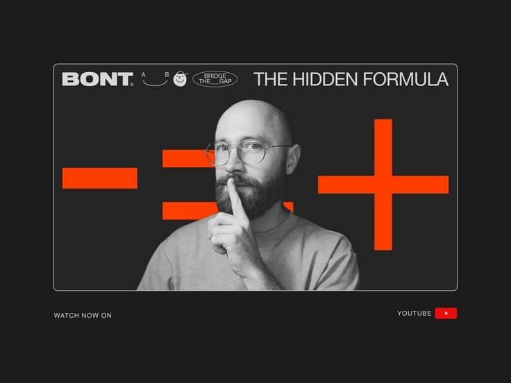
Use it forAgencies, architecture, events, conferences and products that want clarity.
Skip it ifYou want playful or cosy.
Build [a one-page website / a landing page] for [what it is], for [who it's for].
The one thing a visitor must do: [book / buy / sign up / get in touch].
Sections, in this order: [hero, …, contact]. Use my real content: [paste it here, or write: "write it short and specific, no buzzwords"].

Style: Swiss Design. Commit to it on every screen. Don't blend it with any other style.

The idea: order you can see: a strict grid, big sans-serif type set flush left, and almost no colour.
Layout: a visible 12-column grid. Asymmetric compositions, a huge headline at the top left, text flush left with a ragged right edge, numbers used as big graphic elements, 1px rules dividing sections.
Type: [Inter Tight] (or Helvetica if you own it) in two weights. Sizes from a modular scale (for example 14, 18, 24, 36, 56, 96).
Colour: white, black and one red [#E30613]. Red marks only the most important thing on each screen.
Surfaces: flat. No shadows, radius 0–4px, 1px black rules.
Images: black-and-white photography or simple flat geometric shapes, aligned to the grid columns.
Motion: one main move: blocks slide along the grid lines into place, horizontally, quick and precise. Supporting: rules draw from left to right; links underline on hover. Nothing else moves.
Phone (390px wide): a 4-column grid, still flush left, headline still the biggest thing on the screen.
Never: centred layouts, decorative fonts, shadows, rounded cards, more than one accent colour.

Rules for every screen:
- One primary action per screen. Every button says what it does.
- Real text in HTML, never text baked into images. Body text at least 16px, contrast at least 4.5:1.
- Icons from [Lucide] only. No emoji anywhere in the interface.
- No invented stats, client logos, reviews or countdowns.
- With prefers-reduced-motion, skip the motion and show the final state.

Before you finish, check your work and fix anything that fails:
- Every element aligns to a grid column.
- Text is flush left everywhere.
- Red appears at most once per screen.
- Every rule above.
14Minimalism
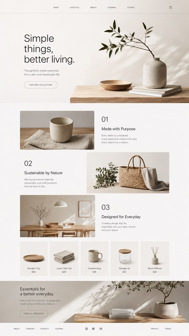
Use it forPremium products, personal sites, studios, apps with one job and anything that must feel calm.
Skip it ifYou have to show a lot of information at once.
Build [a one-page website / a landing page] for [what it is], for [who it's for].
The one thing a visitor must do: [book / buy / sign up / get in touch].
Sections, in this order: [hero, …, contact]. Use my real content: [paste it here, or write: "write it short and specific, no buzzwords"].

Style: Minimalism. Commit to it on every screen. Don't blend it with any other style.

The idea: only what the screen needs, with space doing the design work.
Layout: at most three elements per screen, generous space (section padding around 160px on desktop), one call to action per view.
Type: [Satoshi] in two weights only. Large headline, comfortable body at 18px.
Colour: off-white [#FAFAF9], ink [#0A0A0A], at most one accent, used only for the primary action.
Surfaces: flat. No cards unless they hold a product. Hairline dividers if you need structure.
Images: at most one strong photograph per screen, with space around it.
Motion: one main move: each section fades up 12px once when it enters. Supporting: links underline on hover. Nothing else moves.
Phone (390px wide): keep the space (around 96px between sections), one column, the call to action always visible without hunting.
Never: decorative icons, badges, background patterns, more than one call to action per view, filling empty space just because it is empty.

Rules for every screen:
- One primary action per screen. Every button says what it does.
- Real text in HTML, never text baked into images. Body text at least 16px, contrast at least 4.5:1.
- Icons from [Lucide] only. No emoji anywhere in the interface.
- No invented stats, client logos, reviews or countdowns.
- With prefers-reduced-motion, skip the motion and show the final state.

Before you finish, check your work and fix anything that fails:
- No screen has more than three elements.
- There is one call to action per view.
- Nothing decorative is left.
- Every rule above.
15Maximalism
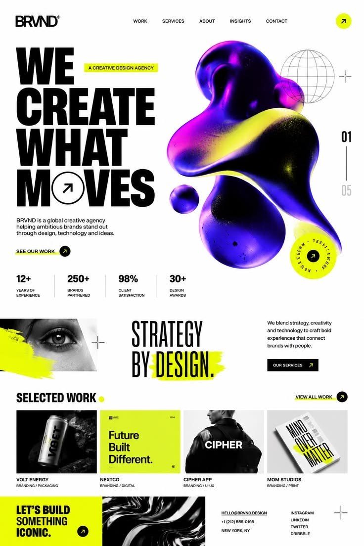
Use it forFashion, music, festivals, food and brands that want energy and attitude.
Skip it ifYour users are stressed or need to finish a task fast.
Build [a one-page website / a landing page] for [what it is], for [who it's for].
The one thing a visitor must do: [book / buy / sign up / get in touch].
Sections, in this order: [hero, …, contact]. Use my real content: [paste it here, or write: "write it short and specific, no buzzwords"].

Style: Maximalism. Commit to it on every screen. Don't blend it with any other style.

The idea: more is more, but with a system: bold colour, pattern and type that still lead the eye to one action.
Layout: layered collages with overlapping photos and type, huge words that run off the edge, patterned bands (checkers, stripes) between sections.
Type: [Bricolage Grotesque] at extreme sizes (96–200px) for headlines, [DM Sans] for body.
Colour: one palette of five bold colours [#FF4F00, #FFD600, #0047FF, #FF8FD1, #111111] used everywhere. Nothing outside the five.
Surfaces: stickers, patterned backgrounds, thick borders mixed freely, but the primary button is always the highest-contrast block on the screen.
Images: cut-out photos, collage layers, sticker shapes.
Motion: one main move: kinetic headlines that scroll sideways in a marquee. Supporting: colours swap on hover; stickers wobble when touched. Nothing else moves.
Phone (390px wide): one collage per screen, headlines still oversized but readable, patterns become thin bands.
Never: colours outside the palette, unreadable body text on patterns, everything animating at once, a call to action lost in the noise.

Rules for every screen:
- One primary action per screen. Every button says what it does.
- Real text in HTML, never text baked into images. Body text at least 16px, contrast at least 4.5:1.
- Icons from [Lucide] only. No emoji anywhere in the interface.
- No invented stats, client logos, reviews or countdowns.
- With prefers-reduced-motion, skip the motion and show the final state.

Before you finish, check your work and fix anything that fails:
- All colours come from the five.
- Body text sits on a calm block.
- The primary action is the strongest thing on each screen.
- Every rule above.
16Luxury Typography
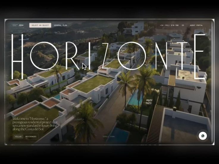
Use it forJewellery, fashion, hotels, real estate, restaurants and premium services.
Skip it ifYou sell on price or speed.
Build [a one-page website / a landing page] for [what it is], for [who it's for].
The one thing a visitor must do: [book / buy / sign up / get in touch].
Sections, in this order: [hero, …, contact]. Use my real content: [paste it here, or write: "write it short and specific, no buzzwords"].

Style: Luxury Typography. Commit to it on every screen. Don't blend it with any other style.

The idea: expensive restraint: elegant high-contrast serifs, wide spacing and a lot of empty space.
Layout: calm, often symmetrical. Huge light headlines, small uppercase labels, products shown small with big margins, thin 1px rules.
Type: [Cormorant Garamond] or [Bodoni Moda] in light weights at very large sizes, [Inter] uppercase at 12px with 0.2em letter-spacing for labels.
Colour: ink [#0E0E0E] and ivory [#F5F1EA], one muted accent [#8B7355]. No gold gradients.
Surfaces: flat, thin rules, square or very small radius, no shadows.
Images: editorial product photography: one object, soft light, lots of background.
Motion: one main move: headlines appear slowly (about 1.2s) as their letter-spacing settles. Supporting: images zoom from 100% to 105% over 8 seconds; links get a thin underline on hover. Nothing else moves.
Phone (390px wide): headlines stay big but break by hand, labels keep their spacing, products full width with space around them.
Never: bold sans-serif headlines, bright colours, badges, discount banners, fast or bouncy motion.

Rules for every screen:
- One primary action per screen. Every button says what it does.
- Real text in HTML, never text baked into images. Body text at least 16px, contrast at least 4.5:1.
- Icons from [Lucide] only. No emoji anywhere in the interface.
- No invented stats, client logos, reviews or countdowns.
- With prefers-reduced-motion, skip the motion and show the final state.

Before you finish, check your work and fix anything that fails:
- Only light serif weights in headlines.
- Labels keep 0.2em spacing.
- No motion is faster than 600ms.
- Every rule above.
17Conceptual Sketch
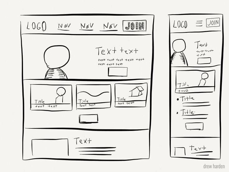
Use it forAgencies, consultants, workshops, early products and "how it works" pages.
Skip it ifYour product is finished and polish is the selling point.
Build [a one-page website / a landing page] for [what it is], for [who it's for].
The one thing a visitor must do: [book / buy / sign up / get in touch].
Sections, in this order: [hero, …, contact]. Use my real content: [paste it here, or write: "write it short and specific, no buzzwords"].

Style: Conceptual Sketch. Commit to it on every screen. Don't blend it with any other style.

The idea: a designer's notebook: hand-drawn wireframes, arrows and margin notes explaining the product.
Layout: a page on blue grid paper. Content inside sketchy hand-drawn boxes, arrows pointing from notes to features, real screenshots taped in where proof matters.
Type: [Space Grotesk] for headings and body, [Caveat] only for notes and arrows.
Colour: paper [#FDFCF7] with light blue grid lines [#C9DAF8] every 24px, ink [#1F2937], pencil grey, one highlighter yellow [#FFF176].
Surfaces: wobbly hand-drawn borders (Rough.js style), hatching for shadows, highlighter strokes behind key words.
Images: simple sketch illustrations, plus real screenshots with tape on the corners.
Motion: one main move: sketch lines draw themselves (stroke animation) when a section enters. Supporting: the highlighter swipes under key words; notes fade in after their arrow. Nothing else moves.
Phone (390px wide): boxes full width, notes move under the thing they explain, arrows shorten or turn vertical.
Never: perfect vector shadows, gradients, glossy buttons, handwriting for body text.

Rules for every screen:
- One primary action per screen. Every button says what it does.
- Real text in HTML, never text baked into images. Body text at least 16px, contrast at least 4.5:1.
- Icons from [Lucide] only. No emoji anywhere in the interface.
- No invented stats, client logos, reviews or countdowns.
- With prefers-reduced-motion, skip the motion and show the final state.

Before you finish, check your work and fix anything that fails:
- Handwriting is only for notes.
- Every arrow points at something real.
- The page is still readable with the drawings off.
- Every rule above.
18Ethereal
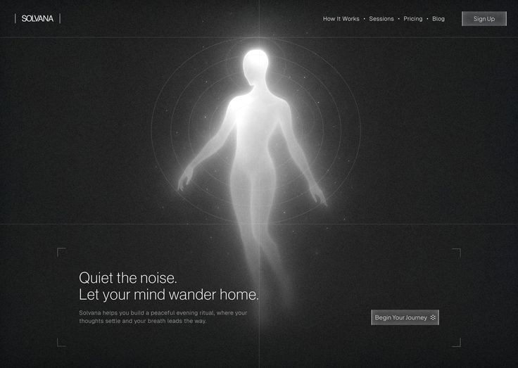
Use it forWellness, beauty, wedding, spirituality, skincare and soft lifestyle brands.
Skip it ifYou need urgency or strong contrast.
Build [a one-page website / a landing page] for [what it is], for [who it's for].
The one thing a visitor must do: [book / buy / sign up / get in touch].
Sections, in this order: [hero, …, contact]. Use my real content: [paste it here, or write: "write it short and specific, no buzzwords"].

Style: Ethereal. Commit to it on every screen. Don't blend it with any other style.

The idea: soft light and air: pale colours, haze and gentle glows, like morning light through a curtain.
Layout: open and floating. Centred headlines, content in soft groups, nothing boxed in tightly.
Type: [Cormorant] light italic for headlines, [Manrope] light and regular for body.
Colour: pearl [#F7F5FA], lavender [#E7E0F5], peach [#FDE8DF], sky [#E3F1F9], text in a soft deep violet [#3B3551] (still 4.5:1).
Surfaces: large blurred radial lights behind content, radius 32px, no borders, a 3% grain so it does not look like a cheap gradient.
Images: soft-focus photography, haze, light leaks, bokeh, airy skin and fabric.
Motion: one main move: the background light drifts very slowly (about 20 seconds). Supporting: long, soft fade-ins (around 1s); elements brighten softly on hover. Nothing else moves.
Phone (390px wide): lights move behind the headline, one column, generous space kept.
Never: hard shadows, pure black, saturated colour, fast or bouncy motion, low-contrast text.

Rules for every screen:
- One primary action per screen. Every button says what it does.
- Real text in HTML, never text baked into images. Body text at least 16px, contrast at least 4.5:1.
- Icons from [Lucide] only. No emoji anywhere in the interface.
- No invented stats, client logos, reviews or countdowns.
- With prefers-reduced-motion, skip the motion and show the final state.

Before you finish, check your work and fix anything that fails:
- Text still passes 4.5:1.
- There are no hard edges or hard shadows.
- The grain hides banding in the gradients.
- Every rule above.
19Bohemian
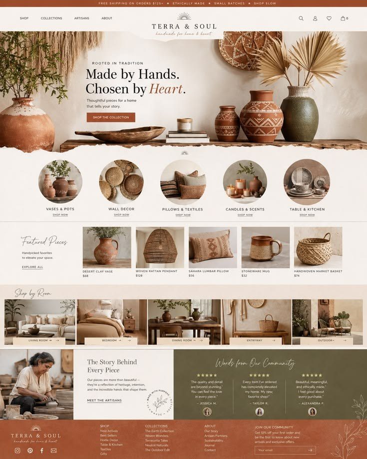
Use it forInteriors, cafés, retreats, handmade goods, ceramics, yoga and travel.
Skip it ifYour brand is tech or very clinical.
Build [a one-page website / a landing page] for [what it is], for [who it's for].
The one thing a visitor must do: [book / buy / sign up / get in touch].
Sections, in this order: [hero, …, contact]. Use my real content: [paste it here, or write: "write it short and specific, no buzzwords"].

Style: Bohemian. Commit to it on every screen. Don't blend it with any other style.

The idea: warm and handmade: earth tones, natural textures and arch shapes, like a sunlit room full of plants.
Layout: relaxed and warm. Images in arch frames, text beside them, wavy section dividers, botanical line drawings in the margins.
Type: [DM Serif Display] for headings, [Work Sans] for body.
Colour: terracotta [#C0623B], sand [#E8D5B5], olive [#7A7A45], cream [#F6EEDF], text in brown ink [#3B2A20].
Surfaces: arch-topped image frames (border-radius 50% 50% 0 0 on the top), organic blob shapes, linen or woven textures at low opacity, no hard shadows.
Images: natural-light photography of plants, textiles, ceramics and hands at work.
Motion: one main move: arch images reveal from bottom to top as you scroll. Supporting: botanical lines draw themselves; gentle hover lifts. Nothing else moves.
Phone (390px wide): arches stay but narrower, text under each image, dividers simplified.
Never: neon, chrome, cold greys, sharp tech UI, stock vector leaves.

Rules for every screen:
- One primary action per screen. Every button says what it does.
- Real text in HTML, never text baked into images. Body text at least 16px, contrast at least 4.5:1.
- Icons from [Lucide] only. No emoji anywhere in the interface.
- No invented stats, client logos, reviews or countdowns.
- With prefers-reduced-motion, skip the motion and show the final state.

Before you finish, check your work and fix anything that fails:
- Every colour is warm.
- Arch frames are the same shape everywhere.
- Textures stay subtle behind text.
- Every rule above.
20Victorian
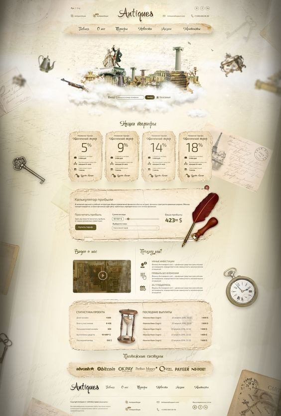
Use it forBarbers, bars, perfume, bookshops, tea, tattoo studios and heritage brands.
Skip it ifYou want modern, light and fast.
Build [a one-page website / a landing page] for [what it is], for [who it's for].
The one thing a visitor must do: [book / buy / sign up / get in touch].
Sections, in this order: [hero, …, contact]. Use my real content: [paste it here, or write: "write it short and specific, no buzzwords"].

Style: Victorian. Commit to it on every screen. Don't blend it with any other style.

The idea: an antique print: ornate frames, engraved illustrations and classic serif type.
Layout: symmetrical, framed sections. Ornamental borders, double rules, drop caps, labels inside decorative frames.
Type: [Playfair Display SC] for headings, [EB Garamond] for body at 19px.
Colour: deep green [#1F3B2D], burgundy [#6B1F2A], antique gold as a flat colour [#B08D57], parchment [#F3E9D2].
Surfaces: SVG flourishes and ornamental corners, engraved line textures, flat gold lines (never gold gradients).
Images: engraved and botanical plates (public domain), sepia photography.
Motion: one main move: ornaments draw themselves around each section as it enters. Supporting: slow fades; a gold underline on hover. Nothing else moves.
Phone (390px wide): simpler frames, ornaments only at section tops, one column.
Never: modern UI chrome, emoji, gradients, sans-serif headlines, ornaments behind body text.

Rules for every screen:
- One primary action per screen. Every button says what it does.
- Real text in HTML, never text baked into images. Body text at least 16px, contrast at least 4.5:1.
- Icons from [Lucide] only. No emoji anywhere in the interface.
- No invented stats, client logos, reviews or countdowns.
- With prefers-reduced-motion, skip the motion and show the final state.

Before you finish, check your work and fix anything that fails:
- Ornaments never sit behind text.
- Gold is a flat colour.
- Body text is a readable serif at 19px.
- Every rule above.
21Cyberpunk
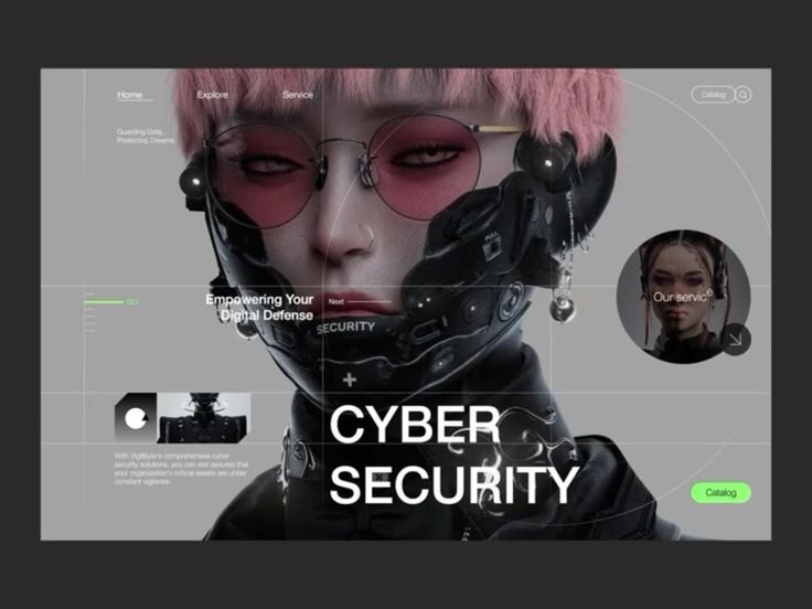
Use it forGames, esports, crypto, nightlife, tech events and bold developer tools.
Skip it ifYour audience is sensitive to flashing or needs calm reading.
Build [a one-page website / a landing page] for [what it is], for [who it's for].
The one thing a visitor must do: [book / buy / sign up / get in touch].
Sections, in this order: [hero, …, contact]. Use my real content: [paste it here, or write: "write it short and specific, no buzzwords"].

Style: Cyberpunk. Commit to it on every screen. Don't blend it with any other style.

The idea: a neon city at night seen through a heads-up display: dark, sharp and full of signals.
Layout: dark sections with HUD brackets around content, data labels in the corners, angled cuts between sections.
Type: [Chakra Petch] uppercase for headings, [Inter] for body, [Share Tech Mono] for data labels.
Colour: near-black [#07070B], acid yellow [#F5F000], hot magenta [#FF2A6D], cyan [#05D9E8]. Yellow for the primary action only.
Surfaces: chamfered corners (clip-path), thin 1px neon lines, HUD brackets, a scanline overlay at 4% opacity. Every label shows real information, not decoration.
Images: night city photography, rain, neon signs, graded towards teal and magenta.
Motion: one main move: a short glitch (RGB split, 150ms) when moving between sections, once. Supporting: HUD numbers count up; chamfered buttons light up on hover. Nothing else moves.
Phone (390px wide): brackets simplified, labels kept to one per block, glitch shortened.
Never: glitch on body text, flashing more than three times per second, pastels, fake data, every element glowing.

Rules for every screen:
- One primary action per screen. Every button says what it does.
- Real text in HTML, never text baked into images. Body text at least 16px, contrast at least 4.5:1.
- Icons from [Lucide] only. No emoji anywhere in the interface.
- No invented stats, client logos, reviews or countdowns.
- With prefers-reduced-motion, skip the motion and show the final state.

Before you finish, check your work and fix anything that fails:
- Nothing flashes more than three times per second.
- Reduced motion removes the glitch completely.
- Every HUD label shows real content.
- Every rule above.
22Wabi-Sabi
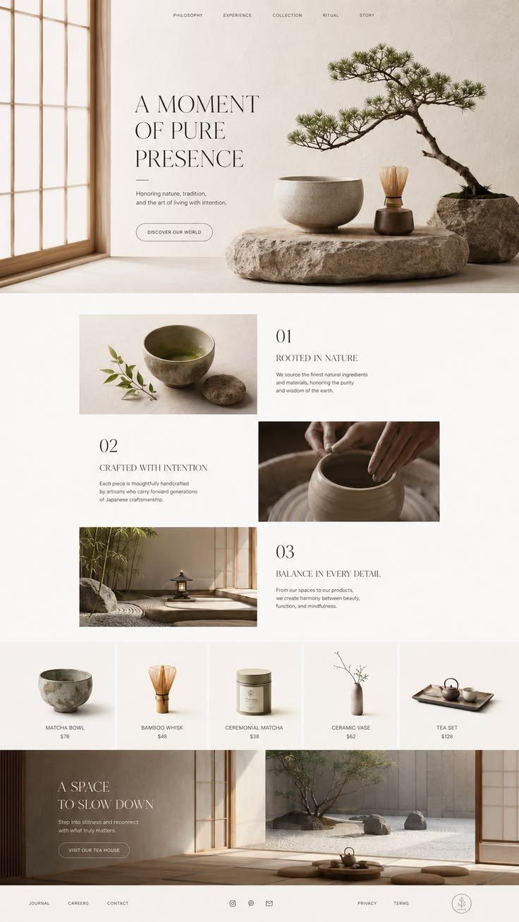
Use it forCeramics, tea, architecture, slow living, natural skincare and crafts.
Skip it ifYou need shine, speed or hype.
Build [a one-page website / a landing page] for [what it is], for [who it's for].
The one thing a visitor must do: [book / buy / sign up / get in touch].
Sections, in this order: [hero, …, contact]. Use my real content: [paste it here, or write: "write it short and specific, no buzzwords"].

Style: Wabi-Sabi. Commit to it on every screen. Don't blend it with any other style.

The idea: beauty in imperfection: natural materials, muted tones, and quiet, uneven compositions.
Layout: asymmetric and off-centre, a lot of empty space, images at uneven sizes, nothing perfectly lined up but everything balanced.
Type: [Shippori Mincho] for headings, [Zen Kaku Gothic New] for body.
Colour: washi paper [#EFEBE3], stone [#D8D2C6], clay [#B9A48A], moss [#6E7358], charcoal text [#2F2D2A].
Surfaces: paper texture, slightly irregular rounded corners (each a little different), no shadows.
Images: ceramics, wood, linen, stone and soft shadows in natural light, muted grading.
Motion: one main move: slow fades (around 800ms), like ink spreading. Supporting: images reveal gently on scroll. Nothing bounces. Nothing else moves.
Phone (390px wide): one column, keep the space and the off-centre placement of images.
Never: gloss, saturated colour, perfect symmetry, bold sans-serif headlines, bouncy motion.

Rules for every screen:
- One primary action per screen. Every button says what it does.
- Real text in HTML, never text baked into images. Body text at least 16px, contrast at least 4.5:1.
- Icons from [Lucide] only. No emoji anywhere in the interface.
- No invented stats, client logos, reviews or countdowns.
- With prefers-reduced-motion, skip the motion and show the final state.

Before you finish, check your work and fix anything that fails:
- Compositions are off-centre but balanced.
- All colours are muted.
- No motion bounces or overshoots.
- Every rule above.
Want the fixes behind these rules, with before-and-after screens? Read Stop AI slop, the guide this list grew out of.
The style examples are Pinterest pins and belong to their designers; each one links to its source. Font names are free fonts on Google Fonts or Fontshare and are suggestions, not requirements.
See all 22 in motion.
The reel flips through every style in under 30 seconds.
@arabi.achref on Instagram